How to document your design system: best practices & tools
What to cover, what tools to use, and how to keep documentation in sync with code as your system evolves.

A design system is only as useful as its documentation. Without it, the components you’ve carefully built go undiscovered, get misused, or get rebuilt from scratch by the next developer who couldn’t find them. A 2026 Design Systems Report from Zeroheight reveals that only 38% of design systems were widely or fully adopted across their organizations, with documentation completeness as one of the strongest markers of successful adoption. Good documentation is what turns a collection of components into a system other people can actually adopt and keep coming back to.
This guide covers what design system documentation should include, the practices that keep it useful as your system grows, and the tools teams use to create and maintain it. It focuses on the developer-facing layer, where the documentation lives closest to the code.
Document your design system with Storybook »

What is design system documentation
Design system documentation is the connective tissue between the people who build a design system and the people who use it. It explains what each component is, how and when to use it, what props or options it accepts, and how it fits with the system’s broader patterns and principles.
It serves two audiences at once. Designers and developers both need to understand the “why” and “when”: principles, usage guidance, and visual references; and the “how”: component APIs, props, code examples, and live, interactive references. Great documentation serves both and acts as a single source of truth that each audience can draw from.
Having a single source of truth matters more than ever in an era of agentic coding. An agent generating UI needs to know what components already exist and how they’re meant to be used; well-structured documentation is what keeps it building on your system instead of reinventing or misinterpreting it at scale. (More on this below.)
This guide is written for developers working on design systems who need the component-level reference that lives alongside their code, while acknowledging the designer’s role throughout.
Key components of design system documentation
Comprehensive design system documentation typically covers five areas:
- Components. This is the heart of the documentation, which developers leverage most. The goal is to help a developer answer “how do I use this right now” in under a minute. For each component, cover what it is and when to use it, the props or API it accepts, its variants and states (hover, disabled, loading, error), and accessibility behavior, and a live, rendered instance of the real component with copyable code. A rendered component that readers can interact with (as opposed to a screenshot or pasted snippet) is essential for readers to grok the component.
- Tokens. The primitives the system is built on, such as color, typography, spacing, elevation, and iconography, expressed as design tokens. These are named values (like
color-primaryorspace-md) that both design tools and code consume. Be sure to document intent in addition to values so developers know when to choose one over the other. - Usage examples. How components combine to solve recurring product problems, including forms, navigation, data tables, empty states, and error handling. When a composition recurs often enough, teams usually build it as a higher-level component. Usage examples cover the rest, showing a working assembly so developers don't have to guess, without committing the team to building and maintaining every variant. This is also where you encode decisions that span components like layout conventions, responsive behavior, accessibility requirements, and content guidelines, so teams don’t have to re-litigate them for each feature.
- Do’s and don’ts. Paired examples of correct and incorrect usage — ideally visual, side by side. A single “don’t put two primary buttons in one dialog” image prevents a misuse faster than a paragraph of guidance, and gives reviewers something concrete to point to.
- Contribution model. How the system grows without fragmenting: how to propose a new component or change, the criteria for acceptance (e.g., used in three or more places), who reviews proposals, and how changes are versioned and released. This helps ensure teams don’t fork components locally and cause drift.
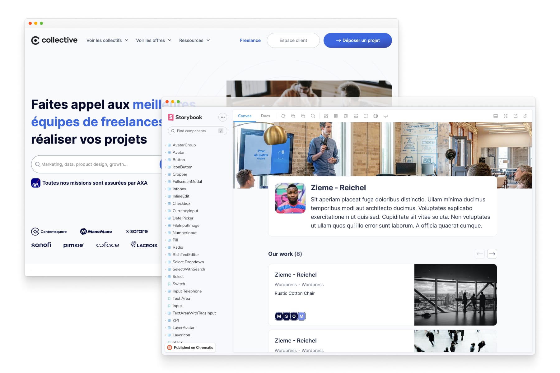
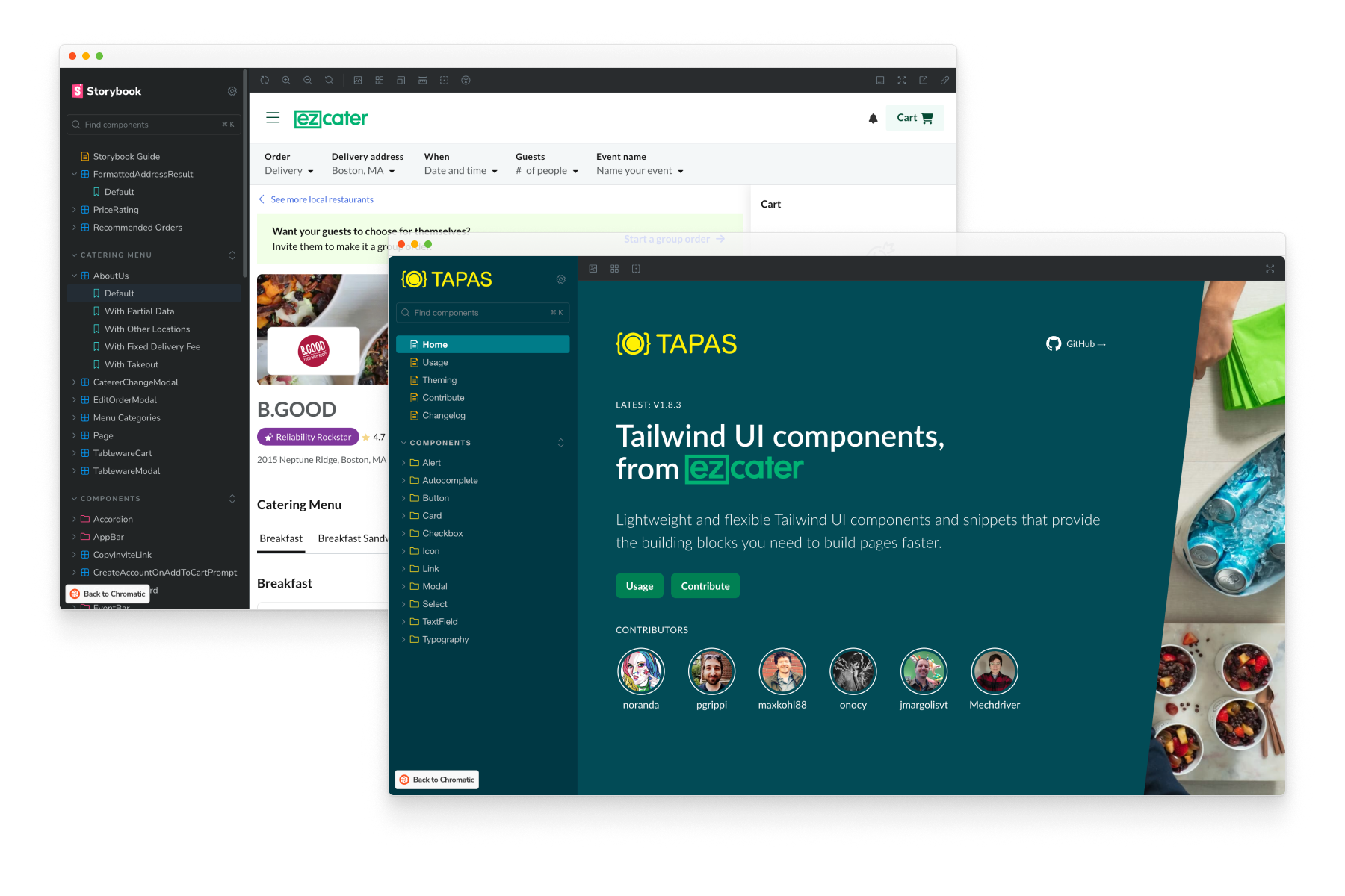
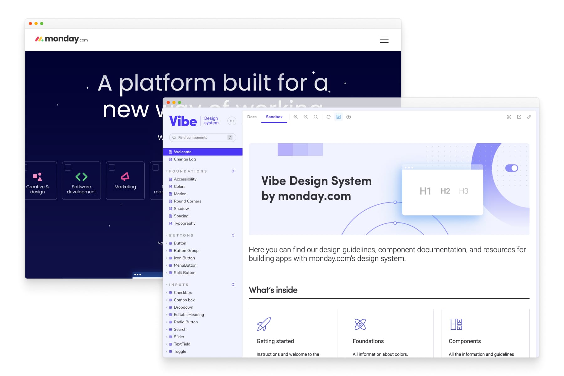
Examples of design systems from Collective, ezCater and Monday.com
Best practices in design system documentation
Write for both designers and developers. Keep content clear and useful for both audiences. Where their needs diverge (principles vs. props) make both easy to find and label clearly.
Keep it in sync with code. Documentation that drifts from the actual components is worse than none, because it actively misleads. Documentation maintenance is a chore, and chores get skipped, which is why the most reliable approach is to generate documentation from the components themselves so that it updates automatically when the code does.
Show live, rendered components. Documentation built from the real, running component shows exactly what ships, lets developers interact with every state and prop in the browser, and updates automatically when the code does. In contrast, a static screenshot or code snippet that doesn't show behavior (hover, focus, loading, error, keyboard interaction) is fundamentally less helpful. Design system tools that render live interactions rather than static documents allow readers to interact with the actual component and understand how to use it.
Make it searchable. People need to find a component in seconds, or they’ll rebuild it. Searchability and clear navigation are core features, not nice-to-haves.
Iterate and version. Treat it as a living product with versions and a changelog, so you iterate on it the way you would any product, rather than as a one-time launch.
Common pitfalls
A few failure modes show up again and again:
Treating documentation as a one-time project. This is the pitfall most likely to kill a design system outright. Documentation maintenance feels like a chore, teams stop doing it, and once the docs no longer reflect the reality of the product, users stop trusting them. Design systems die when trust is lost. Documentation needs an owner, a process, and ideally automation that removes the maintenance chore entirely.
Burying the useful information. Long, theoretical content that hides the practical “how do I use this” answer underneath it sends people away. Lead with what people came for: how to use the component.
Fragmenting across too many tools. Spreading documentation across many disconnected places makes it hard to find anything and hard to keep consistent. Consolidate where you can.
Documenting your design system for AI agents
AI coding agents are increasingly part of how UI gets built, but they're only as good as the context they're given. Without it, agents produce code that can't be merged due to render errors, visual bugs, hallucinated APIs, and net-new components that duplicate ones your system already has.
Design system practitioners see this clearly. In the 2026 Design Systems Report, documentation generation topped the list of AI advances teams are most excited about (57% — the highest of any category), yet only 12% currently use AI to deliver documentation to the tools where it's needed. The demand is for documentation that works harder; the gap is in getting it to the agents and assistants doing the work.
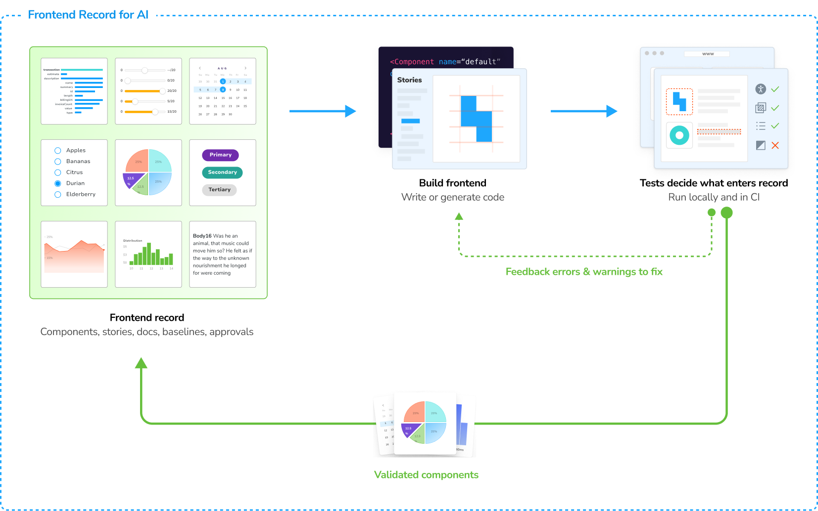
A well-documented design system closes that gap, because the same structure that helps people also feeds agents:
Component context prevents reinvention. When an agent can query your system's documentation, it reuses your existing components instead of inventing new ones. Storybook’s experience validates this theory: in benchmarks generating UI with the Reshaped component library, agents with access to Storybook’s MCP server produced 12.8% better component usage, ran 2.76x faster, and used 27% fewer tokens than agents without it.
Documented states become guardrails. Because each documented state of a component is also a testable story, the same documentation that describes a component can verify it. That verification isn't automatic: the agent needs a tool that runs the tests and hands back the failures. This is what Storybook's MCP server does that, exposing your stories along with their component and accessibility tests, so an agent can check against its own output, read the failures, fix their own work, and only escalate to a human where judgment calls are justified.
Published documentation scales the context across teams. A design system's documentation can be published as a shared MCP server, so every product team's agents draw on the same component context, including access control, versioning, and branch-specific endpoints, even if those teams don't run the design system's Storybook locally. Multiple Storybooks (a design system plus app-specific components) can be composed into a single context source.
Documentation generated from your components is current, structured, and machine-readable, which makes it as legible to agents as it is to people. Documenting your design system well is what makes your system usable by the agents working in your codebase alongside human developers.
Examples of design systems with great documentation
Some of the most widely admired design systems are also the best documented. Each of these is built with Storybook; the links go to their published documentation, with a pointer to their Storybook showcase entry where available.
IBM Carbon: extensive, rigorously maintained documentation spanning design and code. (See it in Storybook's showcase)
Adobe Spectrum: detailed cross-platform component and pattern documentation. (See it in Storybook's showcase)
GitHub Primer: clear developer-facing component references tied closely to code. (See it in Storybook's showcase)



See more examples in the Storybook showcase, and to learn how leading design systems use Storybook, see four ways to document your design system with Storybook.
Overview of tools for design system documentation
Most teams use more than one tool, because design system documentation spans two layers: the designer-facing layer (principles, brand, guidelines) and the developer-facing layer (components, props, live examples). The tools below cluster around those layers, and the right stack depends on which layer you’re strongest in and who maintains the docs.
- Storybook: An open source frontend workshop where components are built, tested, and documented in isolation. Its Autodocs feature generates a documentation page per component from the metadata already in your stories — props, variants, controls — which you can extend with free-form prose via MDX. Strongest for the developer-facing layer: docs live in the repo, are versioned with the code, and update when the code changes, which directly addresses the staleness pitfall. Tradeoff: since the content lives in code, contributions and edits are more challenging for non-technical teammates.
AI capabilities: Native MCP server that gives coding agents access to your components, stories, props, and tests within Storybook so they reuse your system instead of reinventing it.
Document your design system with Storybook → - Zeroheight: A documentation hub for the designer-facing layer, with WYSIWYG editing that lets non-technical contributors own principles, brand, and usage guidance. It integrates with Storybook to embed live stories alongside design specs. Tradeoff: it documents components but doesn’t build or render them itself. The live component layer requires embedding a tool like Storybook.
AI capabilities: Native MCP server (premium plans only) plus an AI suite for writing and building and an AI Assistant that audits existing docs. - Frontify: A brand management platform where design system documentation sits alongside logos, brand assets, and brand guidelines. Strongest when the design system is part of a broader brand governance effort, which is common in large, brand-led organizations. Tradeoff: the least code-centric of these tools; component-level developer reference isn’t its focus.
AI capabilities: Native MCP server exposing brand assets, guidelines, and templates to agents, plus a conversational "Brand Assistant" focused on brand knowledge. - Supernova: A design system platform centered on the pipeline from design sources to documentation and code: it ingests design tokens and Figma structures and publishes documentation from them. Strongest when token management and design-to-code automation are the priority. Tradeoff: a heavier platform adoption than a single-purpose docs tool.
AI capabilities: Native MCP server exposing tokens, components, docs, and assets, plus an AI-powered "Portal" for generating PRDs/specs. - Knapsack: A platform aimed at unifying design, code, and documentation in one shared workspace, so designers and developers work against the same source of truth. Strongest for large cross-functional organizations that want one platform rather than a stack of connected tools. Tradeoff: that consolidation is a bigger commitment than adopting one layer at a time.
AI capabilities: Native MCP exposing design-system context to agents like ChatGPT and Gemini with governance/brand rules attached. - GitBook: A general-purpose documentation platform. A reasonable choice when design system guidelines should live next to other product and engineering docs, with good search and editorial workflow. Tradeoff: no native component rendering — examples are static unless you embed them from a tool that serves live components.
AI capabilities: Every published GitBook site automatically includes an MCP server, plus a GitBook Agent that suggests doc improvements (not component-specific).
For a closer look at specific workflows, see four ways to document your design system with Storybook.
Comparing tools for documenting a design system
In practice, choosing a documentation stack is less “which tool wins” than “which tool owns which layer.” A common stack pairs one designer-facing home (Zeroheight, Frontify, or a custom site) with one developer-facing source of truth (Storybook), connected through integrations: live stories embedded in Zeroheight pages, two-way links between Figma and Storybook via the Storybook Connect plugin and Designs addon, and similar bridges for Zeplin and UXPin. Whatever the stack, the principle from the best practices above holds: the component-level reference should be generated from the code, and everything else should link to it rather than copy it.
When designing your stack, it's helpful to understand the relative tradeoffs of each tool:
* Each tool charges on a different basis. Storybook is free and self-hosted. Zeroheight and Supernova charge per editor/seat (viewers are typically free). GitBook charges per published site plus per user. Frontify bills on monthly active users. Frontify and Knapsack are quote-only annual contracts with no public entry price. Compare total cost for your team's size and editor/viewer split.
Start documenting
Design system documentation determines whether your system gets adopted, both by the designers and developers on your team today, and the AI agents increasingly working alongside them. The good news is that you don’t have to write it all by hand: start from the components you already have, generate the baseline documentation from the code itself, and layer principles and usage guidance on top. Keep it synced, keep it searchable, and treat it as a product. The teams behind the best-documented design systems didn’t document everything at once — they made documentation a byproduct of how they build.
Want to learn more best practices with Storybook? Read our guide on component testing.
 Varun Vachhar