
Design for Realtime
User experience principles for realtime and reactive systems

Since the genesis of the browser in 1993 the reigning web paradigm has been request-response. A user who wanted to view a webpage sent a request to a content server; the server received the request, processed it, and responded with the webpage. This pattern lent itself to linear experiences punctuated by page refreshes. Given that the internet’s original intent was to view documents, request-response was satisfactory. Since then user needs & expectations have evolved.
AJAX technology was the first step in this evolution. It refined the web experience by allowing users to load new content without a page refresh, but was constrained because loading this content still required action from the user. While this was great for singular user experiences like browsing static documents it was untenable when it came to apps with multi-user environments. The internet is not a solitary experience. In 2014 we expect our apps to be connected and react to changes from multiple users’ actions. We want to feel as if our digital connections have a physical presence. This is where realtime technology shines.
Challenges
The introduction of developer-friendly reactive frameworks like React, Angular, and Vue have lead to widespread adoption of realtime UIs and a new set of challenges. Prior to realtime, the provenance of actions was clear. They could be attributed to a single user and were punctuated with a page refresh. Click a link, page flash, and voilà your content has arrived.
Now add several users to this system who act on the same data and whose interface is updated reactively –without a page refresh. Imagine the difficulty in communicating the rationality of the system to the end user. When the interface changes in front of someone despite their inaction there is opportunity for uncertainty to take hold. In the realtime world our challenges are not only to build delightful features, but to translate complexity and illuminate causation in data.
Translation
Translation is to express the sense of words in another language. It is expressing the complexity within our apps in a way that is natural and easy to understand. In practice, this is just reassuring users that our apps can understand, register, and respond to their intent.
Causation
Causation is the relationship between cause and effect. Our goal is to illuminate relationships in data which just means to show how two data points can conceivably lead to a new insight or that lever A affects lever B.
Principles
Creators can harness the power of realtime to drive next-generation web experiences. I have been fortunate to help craft some of these experiences. I’ve also had my fair share of missteps. Out of these challenges emerged a set of simple principles that serve as the starting point for designing realtime user experiences.
1. Be State Aware
The user should know the state of the system. At all times the product should communicate what’s happening and confirm user action.
Applications attempt to provide structure to an otherwise unstructured system. Since realtime reactive interfaces change can without inherent signals like a page refresh creators can be transparent by including the appropriate signals to communicate state.
Example: Connection status
Is your connection active? Connection dropouts are unavoidable. Communicate that there are factors outside of the apps control that could lead to unexpected results.
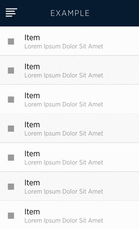
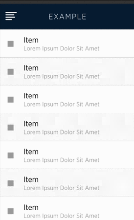
Example: Loading
Low bandwidth, weighty assets, and spotty connections interrupt experiences by causing users to wait. Be a proactive designer by highlighting that the system is processing user action and loading new data.

Example: Confirmation
Responding to user actions shows that the system is listening and cares about their objectives.
2. Expect Change
The user should know what to expect. The product should communicate what will happen when a user acts.
Surprises in a logical system are not delightful. Consider the mechanical precision of an automobile as it transports passengers to their destination. Surprises in this system are flat tires and engine smoke. Like the car, an app facilitates a persons intent and attempts to translate immense machine effort in a user-friendly manner. Unlike the car, the digital medium allows us to anticipate and inform users of change.
Example: Communicate Results
When drastic state changes are possible, foreshadow the result of actions. Giving users opportunities to process what’s going to happen prevents surprises.
Example: Skeleton Templates
Showing a skeleton of your layout foreshadows new screens and sets the expectation that data will fill the empty spaces. As a side benefit, your app also feels more responsive.
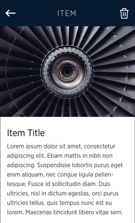
3. Preserve Context
The user should know where content comes from and where it belongs.
Since we can’t possibly see or even consume what’s happening at all times in realtime apps, it’s important that we establish and reinforce the sense of space –where each screen and button lives in relation to other elements. Doing so means that we create landmarks that the user can rely on to get their bearings.
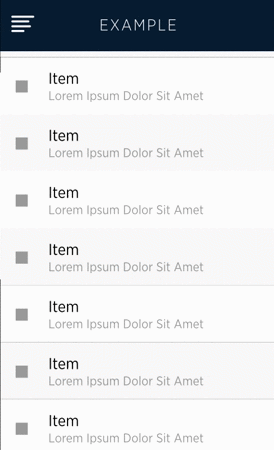
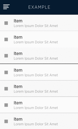
Example: Consistent Placement
New content should appear in a predictable location. Get users accustomed to navigating to key points in your app. Don’t dilute actions by providing several ways to accomplish the same thing.


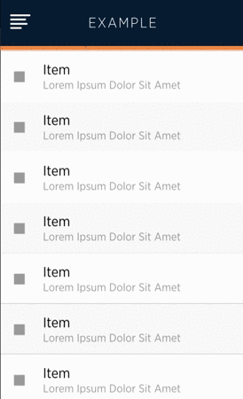
Example: Maintain Bearings
Articulate state changes that do not appear in a predictable locations. Animation can be used to great effect to communicate where new content is loading and its relationship to its surroundings. Slowing the user experience sometimes results in greater clarity.
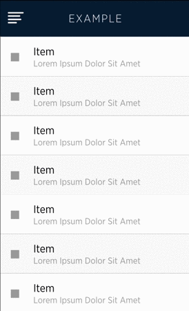
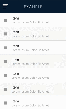
Example: Save Scroll Position
When moving back and forth between distinct screens, ensure that users return to the same scroll position they entered from.

Conclusion
Principles are foundations to build upon. These principles serve as a starting point when crafting realtime experiences. I encourage all creators to discover what works for them, but for a head start try: be state aware, expect change, and preserve context.
Reference
Ideas in this article build upon and were inspired by these fantastic researchers, designers and companies:
- Luke Wroblewski’s excellent UX video series
- Chartbeat’s inspiring realtime analytics product
- Sacha Grief’s insight into designing Telescope –a realtime Hacker News
- Apple Human Interface Guidelines
Originally published at Percolate Studio’s blog