Publish Storybook to work together

Simplify collaboration by publishing Storybook to a shared online workspace that your entire team can reference. Each component is documented, versioned, and searchable in the cloud.

Storybook iconMade for Storybook
muji logo
theguardian logo
github logo
nespresso logo
docusign logo
turo logo
muji logo
theguardian logo
github logo
nespresso logo
docusign logo
turo logo
muji logo
theguardian logo
github logo
nespresso logo
docusign logo
turo logo
muji logo
theguardian logo
github logo
nespresso logo
docusign logo
turo logo
muji logo
theguardian logo
github logo
nespresso logo
docusign logo
turo logo

Create a single source of truth for your team

Chromatic brings together your production UI, tests, documentation, feedback, and design files in one searchable workspace. Your components are published to a secure CDN automatically to ensure that your team is up to date.

Chromatic's library screen visualizes the latest components on a branch-by-branch basis. Browse existing components to reuse or reference. Use the branch picker to find branch-specific components.
Storybook
Publish multiple Storybooks
Bring multiple projects into a shared workspace that your entire team can reference.
GitHubBitbucketGitLab+ SSO/SAML
Syncs with version control
Sync permissions and access with GitHub, Bitbucket, GitLab, and SSO
Figma
Works with Figma
Embed Figma to quickly compare the implementation to the design.
Searchable component libraries
Find out how and where UI components are used in your projects.
Get a custom domain
Enable your projects to be accessed via your unique domain name, providing you with a memorable URL for sharing.
Share permalinks
Send teammates a link to specific instance of a component to ensure they're referencing the exact UI you are.
“Setting up a first-class, cross-discipline contributor experience used to take my teams months. Today, I can build it myself in a few clicks thanks to Chromatic!”
Kaelig Deloumeau-Prigent
Principal software engineer
Netlify

Play with components interactively

Interact with your components in a sandbox environment complete with test cases, usage docs, cross-browser snapshots, and design specs. All in one convenient place.

Inspect client-side code
Confirm component behavior by inspecting the fully rendered DOM, styling, and assets. You see what your users see.
Component API and usage docs
Docs, API, and example use cases from Storybook are synced with Chromatic and shown alongside your components.
Browsers you can test with
Snapshot UI in different browsers
See how UI renders across browsers in a glance without leaving your browser.

Embed stories in wikis and Markdown

Chromatic supports oEmbed and standard iframes for embedding stories in Notion, Medium, and countless other platforms. All you need is the URL for a Storybook published on Chromatic. In many cases, they'll get unfurled automatically.

Apps you can embed stories intoConnector line between app and storyExample story
+ and oEmbed
“All of the capabilities Storybook & Chromatic provide allow us to deliver quality core libraries with over 80 contributors from within and outside of monday.com”
Orr Gottlieb
Orr Gottlieb
Engineering manager
monday.com

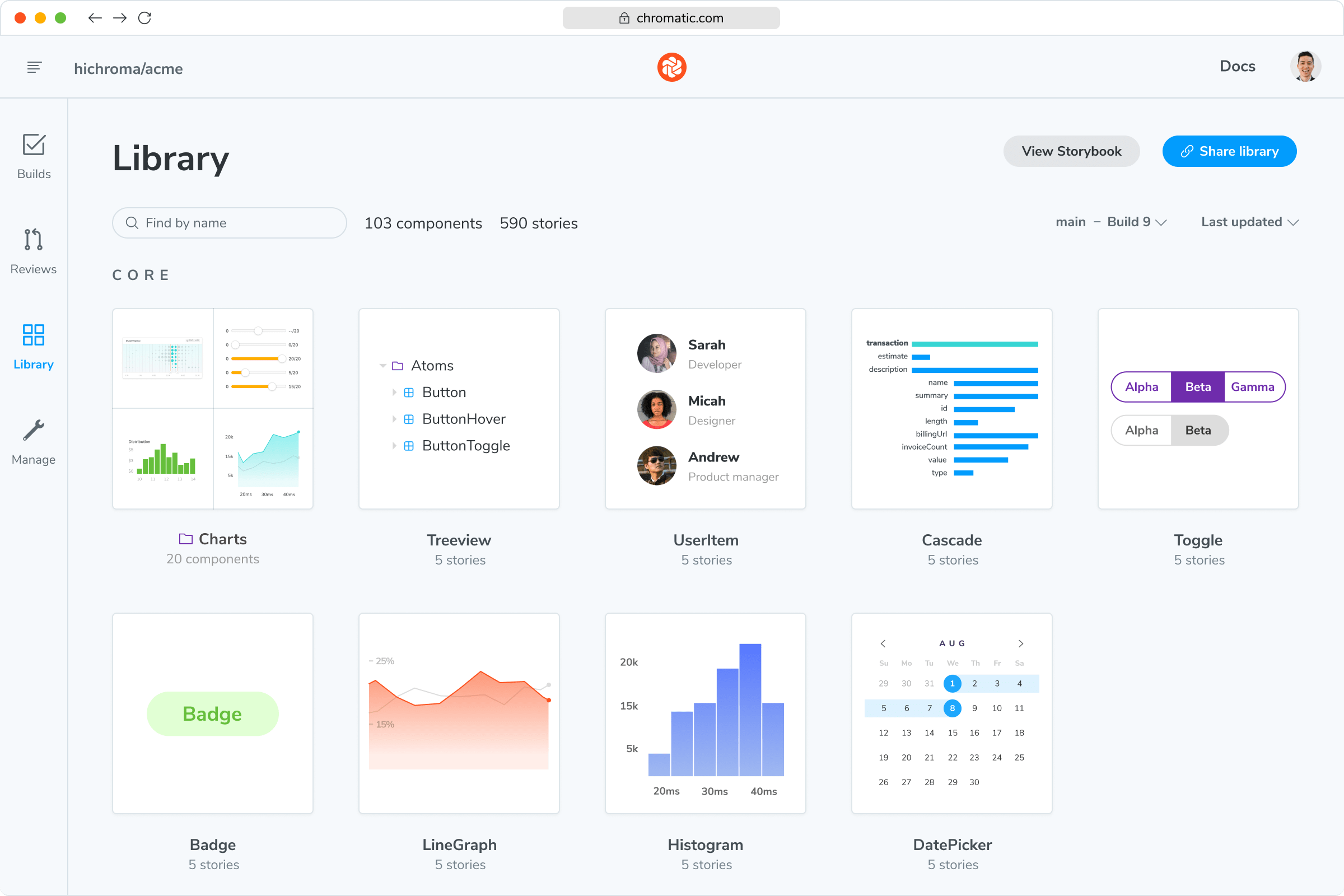
Track component history & versions

While publishing the Storybook, Chromatic indexes and versions your components in a searchable library. This enables teams to discover existing components for reuse. It also helps you investigate bugs by travelling back in time.

component history image
Arrow
component history image
Arrow
component history image
Arrow
component history image
Arrow
component history image
Arrow
component history image
Arrow
component history image
Arrow
component history image
Arrow
component history image
Arrow
Catalog all your components
Explore UI components from across your company in one place without touching a repository.
History down to the commit
Compare components across branches & commits to review past versions.
Stays up to date
Every time you push code your library is auto-updated.

Build a safe workspace for frontend teams

It takes a team to build and maintain production UIs. Chromatic was designed from the start for seamless collaboration. Securely invite collaborators into your projects to get feedback and sign-off.

Easy access control

Team permissions are auto-synced with GitHub, Bitbucket, or GitLab collaborators. Anyone who has access there will have access to Chromatic.

Syncs with
GithubBitbucketGitlab
+ SSO/SAML
Manage collaborators in Chromatic
Invite all collaborators
Customize access by inviting designers, product managers, and other stakeholders by email or link.
Fine-grained roles
Roles give you fine-grained control over who can do what. There are four roles that can be assigned to any collaborator.
Secure and reliable
Chromatic is tuned for high performance enterprise teams with features like SSO, SLA, and SOC 2 compliance.
Cut the back-and-forth to ship UIs faster.

Frequently asked questions

“Chromatic has been essential in giving us the confidence to release our distributed component libraries quickly and often.”
Doug Hogan
Doug Hogan
Engineering director
O'Reilly Media