Storybook for design
How to integrate your favorite design tools with Storybook
Imagine a world where the design to development workflow was seamless. If you could connect design deliverables to the bonafide UI implementation, your team could build UIs faster with greater confidence.
You’d stop hearing questions like “does this look right?”, “do you have a design for this?” and “is this documented anywhere?” You wouldn’t need to context switch from development to design tools and back again.
This article showcases groundbreaking Storybook addons that bridge design and development. Storybook users will be able to unlock new techniques that help promote pixel perfection and sync UI documentation automatically.
Why are addons so powerful?
The addon ecosystem is one of the top reasons for Storybook’s popularity. Addons give developers superpowers to customize Storybook and share customizations with others. As the Storybook community grows everyone gets the benefit of more timesaving addons.
For instance, the GraphQL addon helps devs browse the GraphQL schema and query their API from inside Storybook. The a11y addon highlights accessibility violations in the Storybook preview window instantly. The i18n addon assists with internationalization. Today, we’ll explore some of the most innovative addons for design.
Design handoff addons
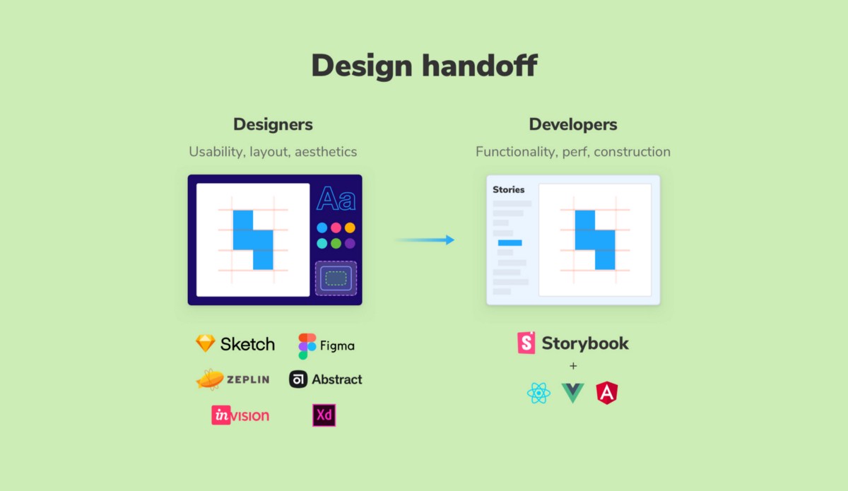
Design handoff is the process of, well, handing off static images, specs, and prototypes for developers to build. If you’ve ever been on the receiving end of the handoff, you know that it can be messy.
You inevitably end up spelunking through design docs or mixing up the versions. Once the FINAL-FINAL-v3 design is unearthed, you jump between editor, design, and Storybook to build the UI. And don’t forget about the missing states from design that need to be accounted for in development.
These addons streamline the design handoff process by embedding the design artifacts alongside your development workspace. That helps surface design inconsistencies earlier in the development process. What’s more, you’ll have an ongoing record showing the component design beside what’s actually built.
Figma addon
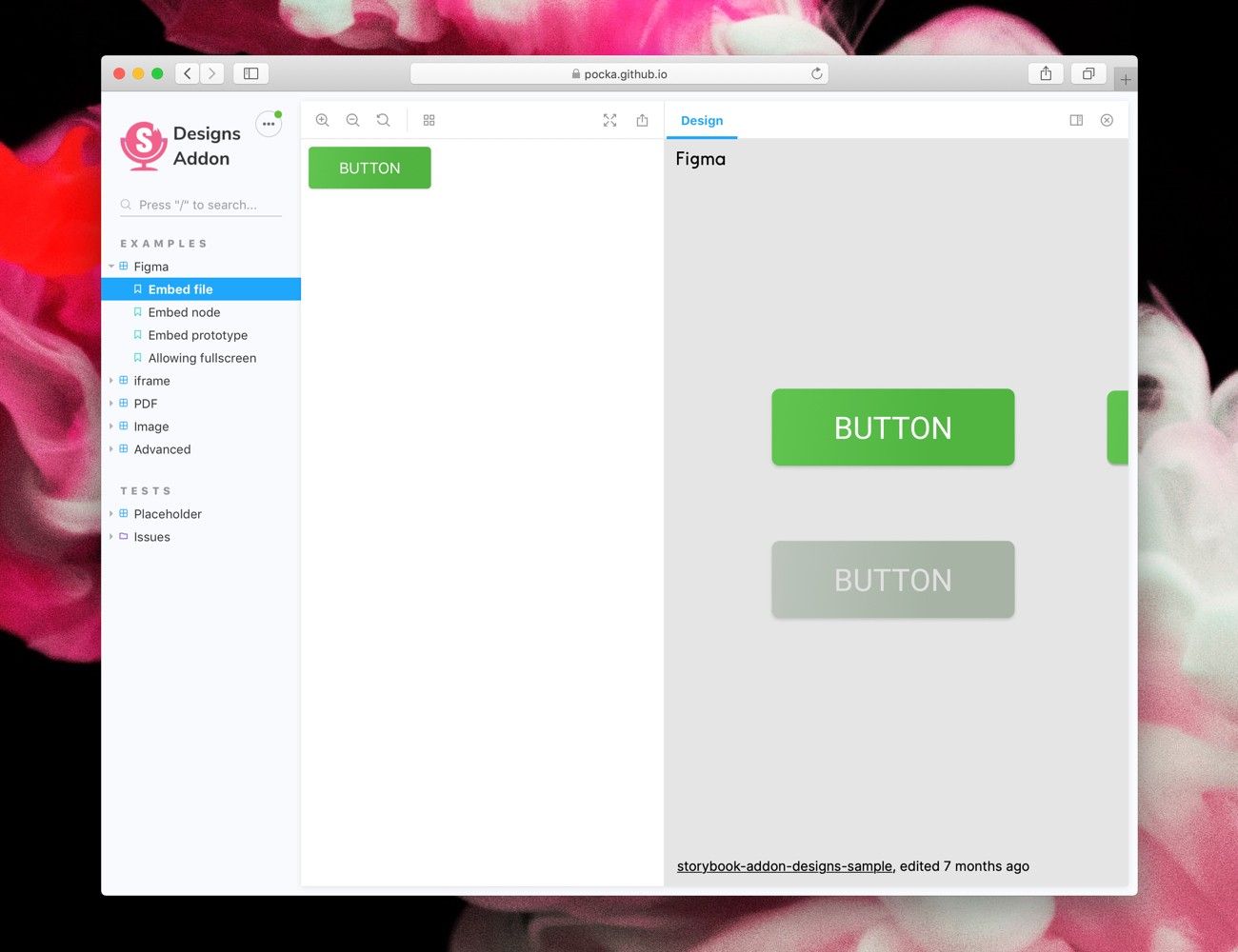
Figma is a popular collaborative UI design tool used by teams at Slack, Twitter, and Dropbox. It allows multiple people to work on the same design simultaneously in the browser. The Figma addon depicts the component design next to the implementation. Design changes will automatically be reflected in Storybook.
Abstract addon (for Sketch and Adobe XD)
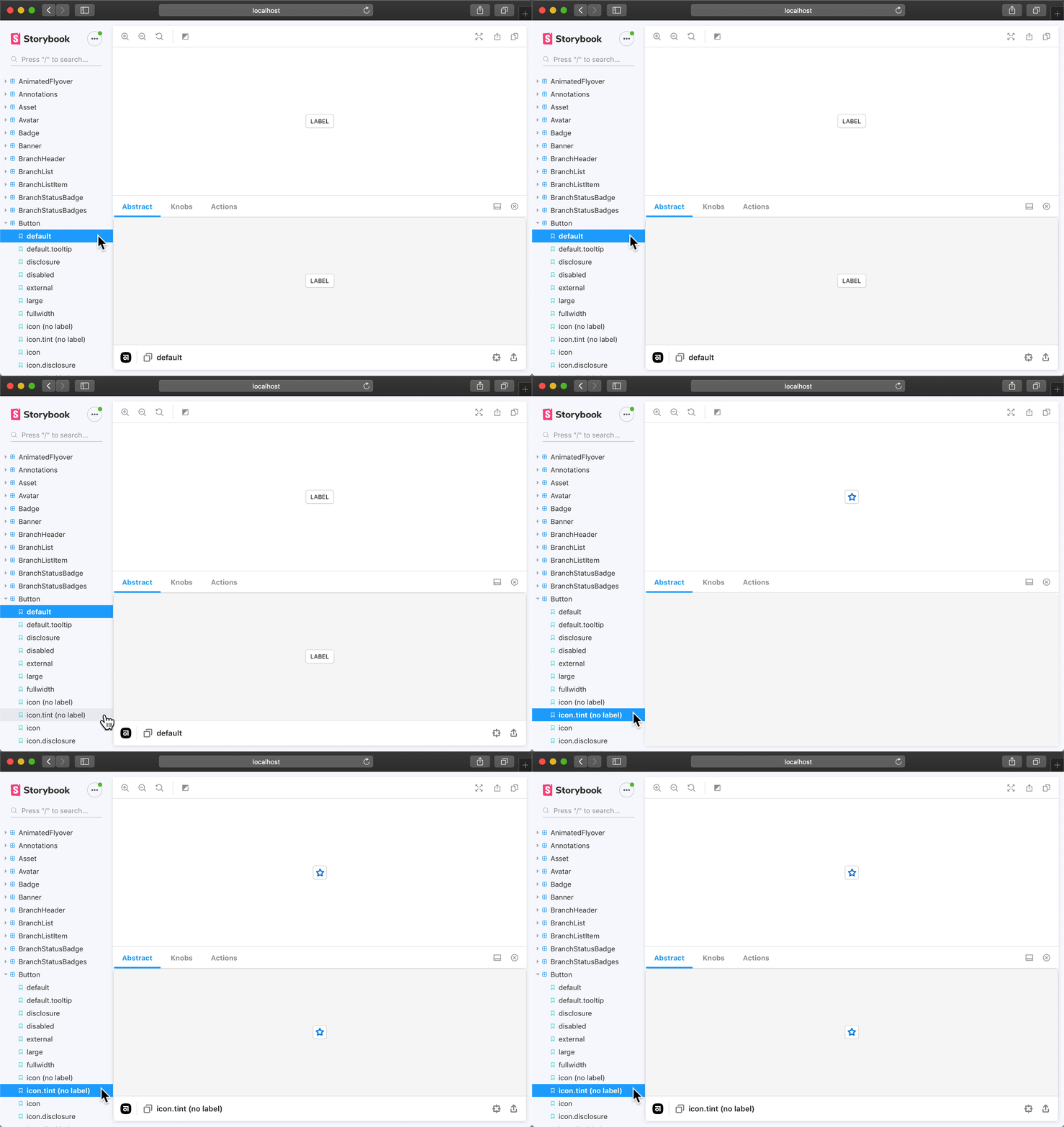
Abstract is a version control tool to Sketch and Adobe XD files. It helps teams at Microsoft, Spotify, and Zendesk track visual changes and ensure everyone is working from the same source of design. The addon showcases designs from Sketch in the Storybook addon panel. Developers can measure distances, export images, and sample colors from the comfort of Storybook.
Component library documentation addons
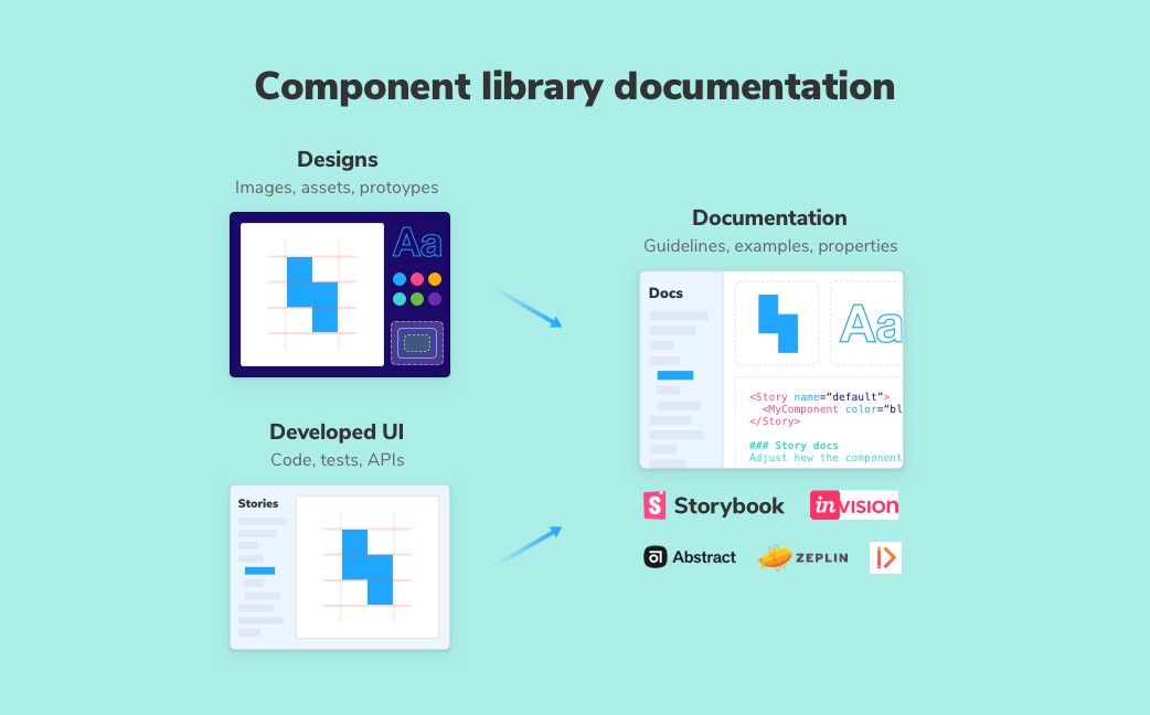
Documentation helps teams reuse existing work instead of rebuilding new UI. It’s doubly important in component libraries and design systems because they’re intended for wide distribution.
However, documentation often takes more work than folks expect. You end up sinking time into non-documentation tasks like site infrastructure, wrangling technical writers, and maintenance instead of actually writing docs.
Storybook already provides lightweight documentation out of the box (although we don’t call it that) by naturally encouraging developers to save UI component variations as “stories”. Documentation addons amplify this core capability to help interdisciplinary teams stay in sync.
Storybook Docs
The official Storybook Docs addon generates a customizable documentation site for your component library or design system. It succeeds the popular info addon with first class support for Markdown, MDX, and JSDoc syntax.
Under the hood, SB Docs uses industry-standard docgen tooling to build API docs from stories. Bring design artifacts into SB Docs by embedding them via an iframe from Figma or Sketch (with Abstract).
InVision Design System Manager
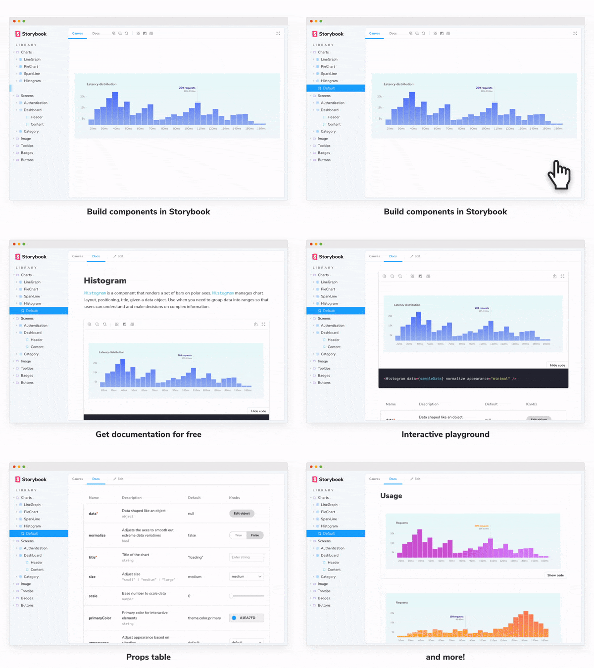
InVision DSM is a design system documentation tool. It helps design teams consolidate UX principles, user interface design, usage guidelines, tokens, and more in a shared documentation site.
DSM allows you to view Storybook components in the DSM app alongside the designs (which are extracted from Sketch). Teams can interact with the UI component implementation in the context of the design system before integrating it in their apps.
Zeplin
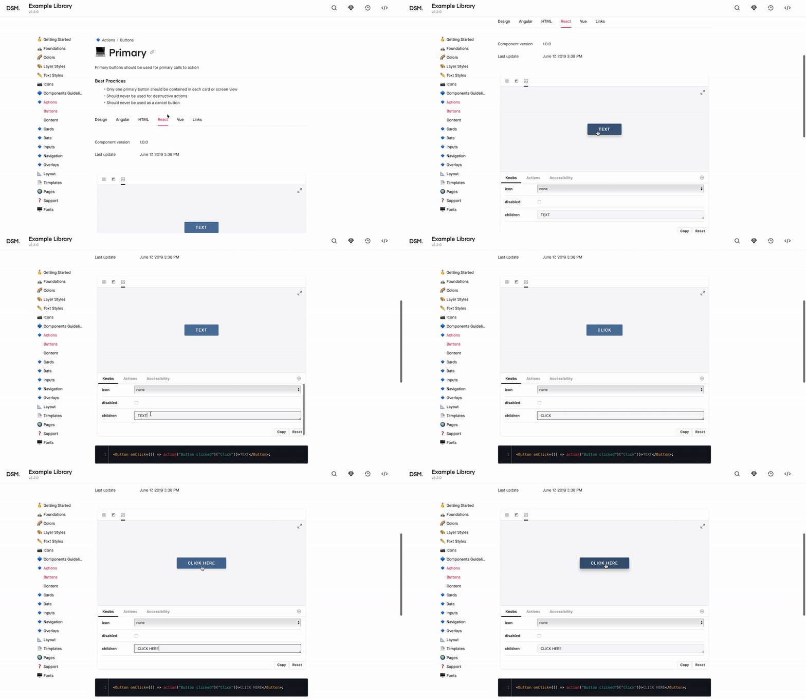
Zeplin is a design handoff tool that generates styleguides from design files. It auto extracts metadata like assets, colors, and measurements from design files to make it easier for developers to adhere to the design spec. Zeplin allows you to link off to Storybook components from inside their desktop app.
Zeroheight
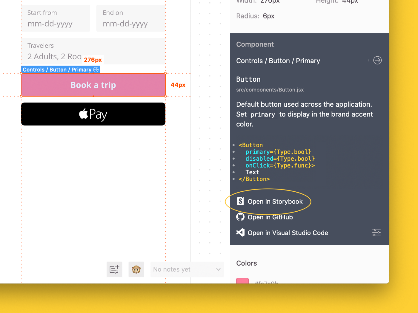
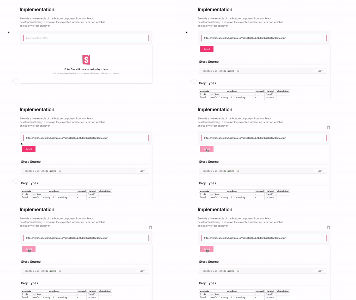
Zeroheight is a collaborative styleguide generator for design systems. It showcases design, code, brand, and copywriting documentation in one place. Users can easily edit that documentation with a WYSIWYG editor. The addon brings Storybook components into Zeroheight to display alongside Sketch, Figma, or Adobe XD designs.
Story2sketch for Sketch
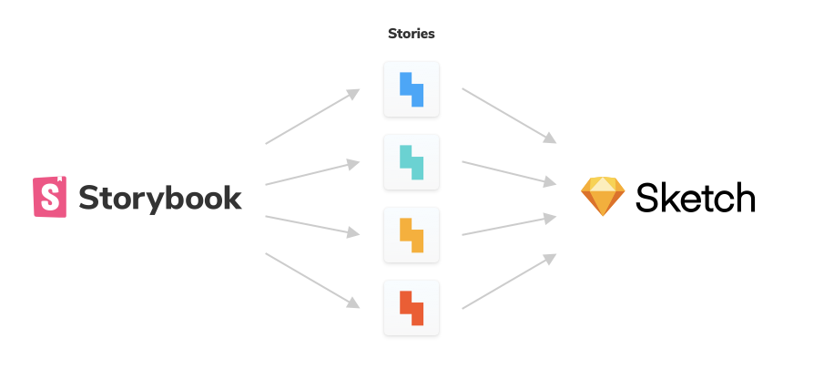
UI components are the source of truth for designers and developers alike. Story2sketch allows you to build a Sketch file from components in Storybook. This helps designers keep their Sketch files current with the latest UI patterns.
Design Token
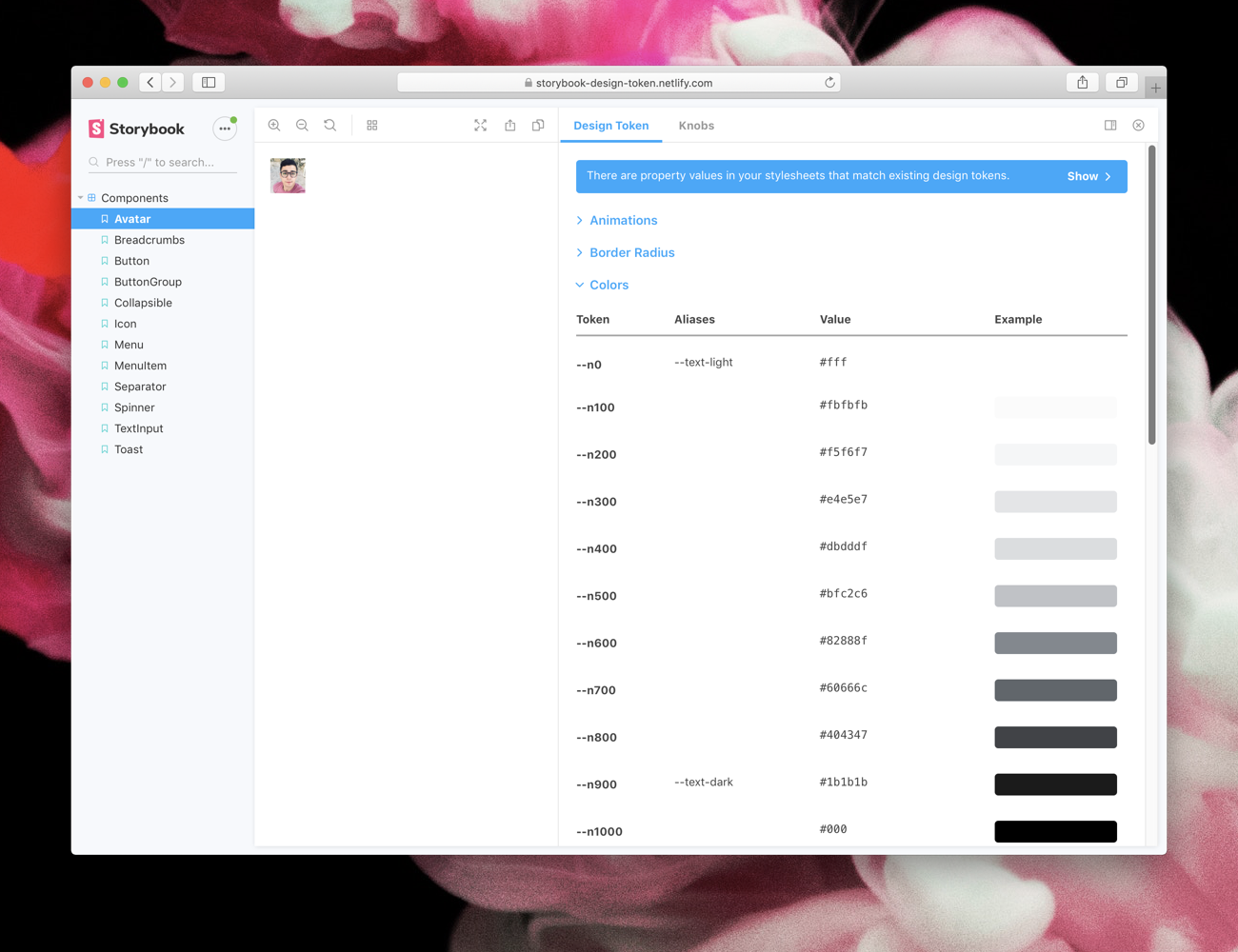
A “design token” is a styling constant for variables like typography, colors, spacing, and animation. Tokens are distributed by design systems for reuse across many projects. This addon extracts design token documentation from your stylesheets to display during development.
Conclusion
Connecting design and development helps teams identify edge cases before shipping and rapidly respond to flaws after shipping.
Neither developers nor designers alone can predict every user’s interactions and edge cases. Mike Tyson once quipped that “everyone has a plan until they get punched in the face.’’ Indeed, this applies to creating UIs just as it does to boxing because users always break your assumptions. That’s why we need to work with design to build more thoughtful, defensive UIs.
Learn how to build addons
What’s next
Everyone benefits when their favorite tools collaborate to make life easier. Storybook is an open source platform. We’re excited to work with addon creators to build more robust ways to integrate and extend the platform.
🎨 If you’re a design tool interested in addons, we’d love to learn and support you. Chat with Michael Shilman and Norbert de Langen in Discord chat #maintainers channel.
Storybook is maintained by +800 open source contributors and guided by a steering committee of top maintainers. If you are interested in contributing, check out Storybook on Github, create an issue, or submit a pull request. Join us also in the Discord chat. Donate on Open Collective.