Story Modes are here
Simultaneously test themes, viewports, locales, and a11y—plus some early features access and more

This month, we’ve launched a new workflow called “Modes” that extends Storybook’s global-level configurations (“globals”)—like viewport sizes, themes, languages, and locales–into your Chromatic tests.
Below, learn more about the feature and how it works—plus other updates our team have been cooking up in the last month.
What are modes?
In the same way individual components often have multiple variants—based on props, application state, or API responses—apps often have global-level variants. These combinations can be as straightforward as displaying a component in light or dark mode. Or they can involve more complex combinations like viewport size, theme, and locale.
Modes simplifies the process of testing a story with different global configurations by letting you save combinations of globals as unique “modes.” A mode might correspond to any one of your global settings. Or you could group multiple global settings that you want to test together into a single mode.
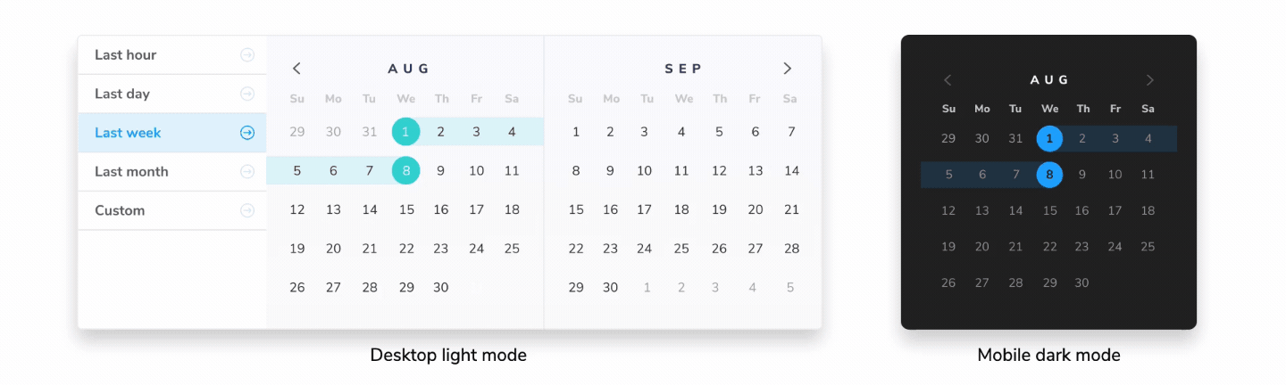
For instance, you might define a mode called light small that uses your light theme and sets a small viewport size. Or you might define another called dark xlg japanese that combines your dark theme with your extra large viewport size and sets the locale to Japan.
How do modes work?
In Storybook, you would typically use viewports, styling, and background addons to control the theme, dimensions, and background color of a story. These would be globally defined in .storybook/preview.ts then used via the Storybook toolbar or declaratively when defining stories.
Using modes for Chromatic, you could assign a single mode to test any of those global settings. Or group global settings you want to test together into one mode for convenience. You’d define all of your modes in a .storybook/modes.js|ts file.
For example, you might have something like this:
// .storybook/modes.js|ts
export const allModes = {
  'Spanish': {
    locale: 'es'
  },
  'Desktop high contrast': {
    backgrounds: 'light',
    theme: 'light',
    viewport: 'desktop'
  },
  'Mobile dark': {
    backgrounds: 'dark',
    theme: 'dark',
    viewport: 'small'
  }
};
Once your modes are defined, you can then import them into your stories to use as you need, on the chromatic parameters object:
// MyComponent.stories.ts
import { allModes } from '../.storybook/modes'

export default {
  parameters: {
    chromatic: {
      //🔶 Test each story for MyComponent in three modes
      modes: {
        'Spanish': allModes['Spanish'],
        'Desktop high contrast': allModes['Desktop high contrast'],
        'Mobile dark': allModes['Mobile dark'],
      },
    },
  },
};

export const Base = {};
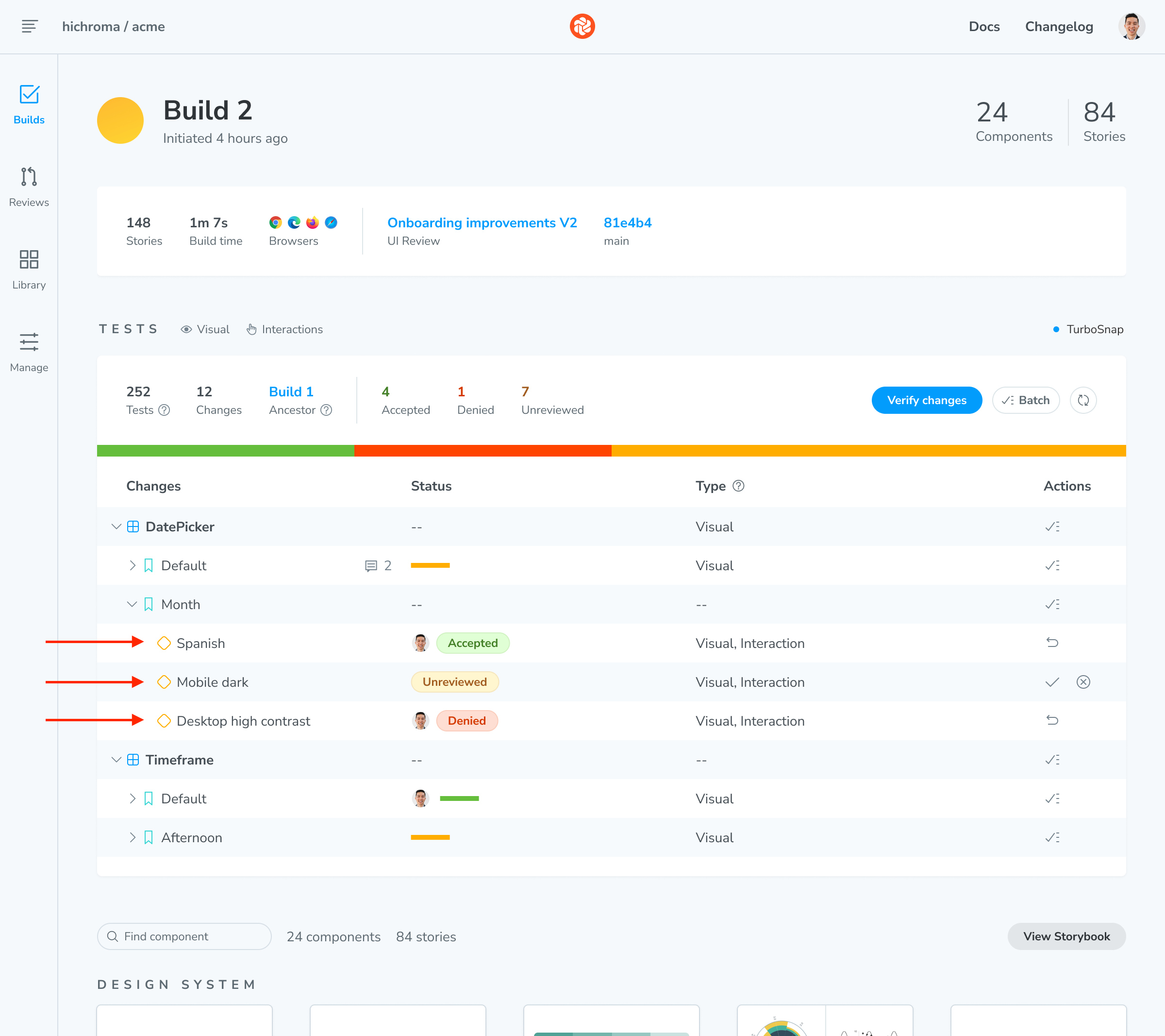
When you run a Chromatic build, it will create a test for each mode you’ve defined for your story. If you have two stories with two modes each, you’ll get four tests. Each test will be titled with the mode’s name in the web app and have separate baselines and approvals.
Start using modes now
There’s so much more you can do with modes—we’re just scratching the surface here. For more details, check out the docs.
Story Modes are here! They let you access a new Chromatic workflow for testing components with multiple themes, viewports, and locale settings.https://t.co/sKxUu4lLks
— Chromatic (@chromaui) September 6, 2023
Here's how they work! ↓ pic.twitter.com/wDtOwhAwyP
Get early access to our newest features
Visual Tests addon

The Storybook team is currently working on a new addon—powered by the same technology as Chromatic—that will let you bring automated visual testing directly into your local Storybook instance: the Visual Tests addon. You can use the addon to pinpoint visual changes in stories across browsers and viewports. Sign up to get early access (with free usage!) and project updates.
👉 Sign up for early access & free usage
Playwright E2E integration

Take Playwright’s end-to-end tests further with automated visual testing. Chromatic's Playwright integration adds comprehensive visual coverage of every key page in your app. It piggybacks on your existing E2E test runs to take image snapshots of key pages in your app.
👉 Sign up for early access to E2E visual testing
Improvements
- Add support for integrating GitHub Enterprise Server with Chromatic.
- Add the ability to link on-prem GitLab from the UI.
- Added support for pnpm in the Chromatic CLI.
- Improved Figma Plugin to pin a story so a user doesn’t lose the story when deselecting the Figma layer.
- Show default reviewer assignment in UI Review activity.
- Add support for the
scheduleevent in the Chromatic Github Action. - Show components from the last build for a project’s default branch on the Library page instead of the previous build for the entire app.
Fixes
- Adjust billing logic to track usage after a build succeeds.
- Resolved issue with race conditions when refreshing git provider access tokens.
- Resolved issue where hover states and keyboard navigation are broken on mention lists in comments.
- Resolved issue where UI Reviews without changesets are being assigned a default reviewer.
- Resolved issue where default reviewers that were removed from UI review automatically get reassigned when a new build completes
- Resolved issue where BitBucket organization API calls would fail using the login instead of the slug field in the endpoint URL.