New Library for UI components
Live View is out of beta + Library UX overhaul
Live View 1.0 + Library UX overhaul
Each day frontend developers create and connect hundreds of components to build incredible features. Juggling all of these components is tough because they’re scattered across branches, built by different teams, or require you to run code to interact with them.
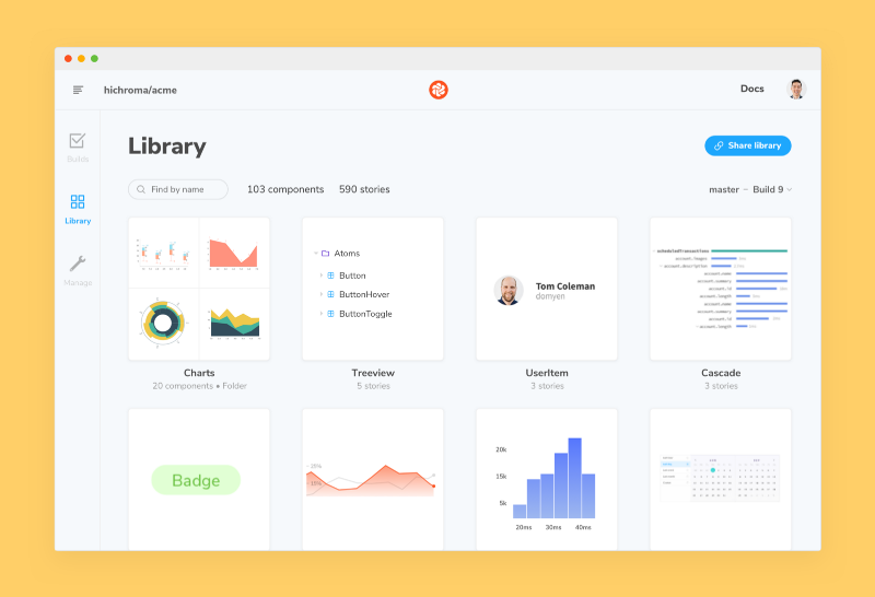
The overhauled Library in Chromatic gives your team a single source of truth that’s synced with your GitHub, Bitbucket or GitLab workflow. This helps developers browse and reuse existing work in one shared workspace online.
- ⚡️Live View 1.0: Improved speed/stability for faster reproductions
- 🔍 Instant search: Find components by name in milliseconds
- 🗂 Hierarchy: New design that visualizes the Storybook folder structure
- 🎨 Storybook Design System: Improved accessibility and UI durability
- 📦 Package v2.0.: Update to use the new features
Chromatic is a visual testing service for Storybook by Storybook maintainers. It pinpoints UI changes in your stories automatically whenever you push code.
⚡️ Live View 1.0 — reproductions made easy
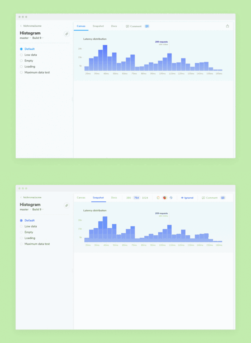
Live View shows the fully-inspectable component just like in Storybook without needing a dev environment or fussing with node_modules. Teams use it to review interactivity and reproduce tricky bugs.
This release increases the speed and stability of Live View. It’s now the default experience whenever you view a component. In addition, eject the iframe to see the live component in isolation in a new tab.
Click the “snapshots” tab to access your component’s snapshots taken in multiple viewports and browsers.

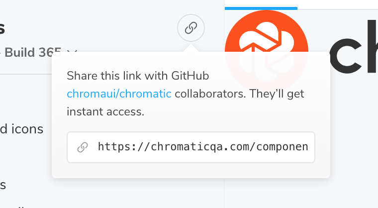
What’s more, it’s easy to link directly to components to review work-in-progress or ask your team for help.
📚 Library overhaul— browse faster

When you use Chromatic your components are visualized to help you recognize them in a glance. The new and improved library mirrors Storybook’s directory structure just as you’d expect.

For folks working with hundreds of components and stories this makes navigation more intuitive.
And if you know the component by name, Chromatic’s new instant search helps you find it in milliseconds.
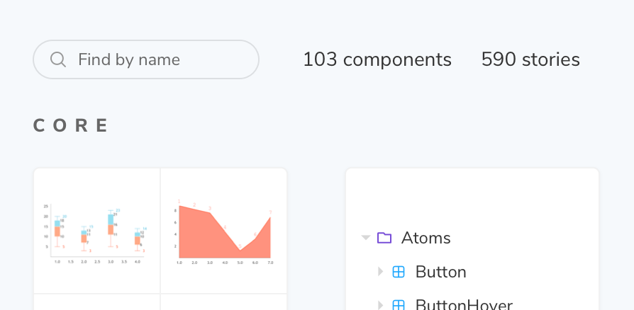
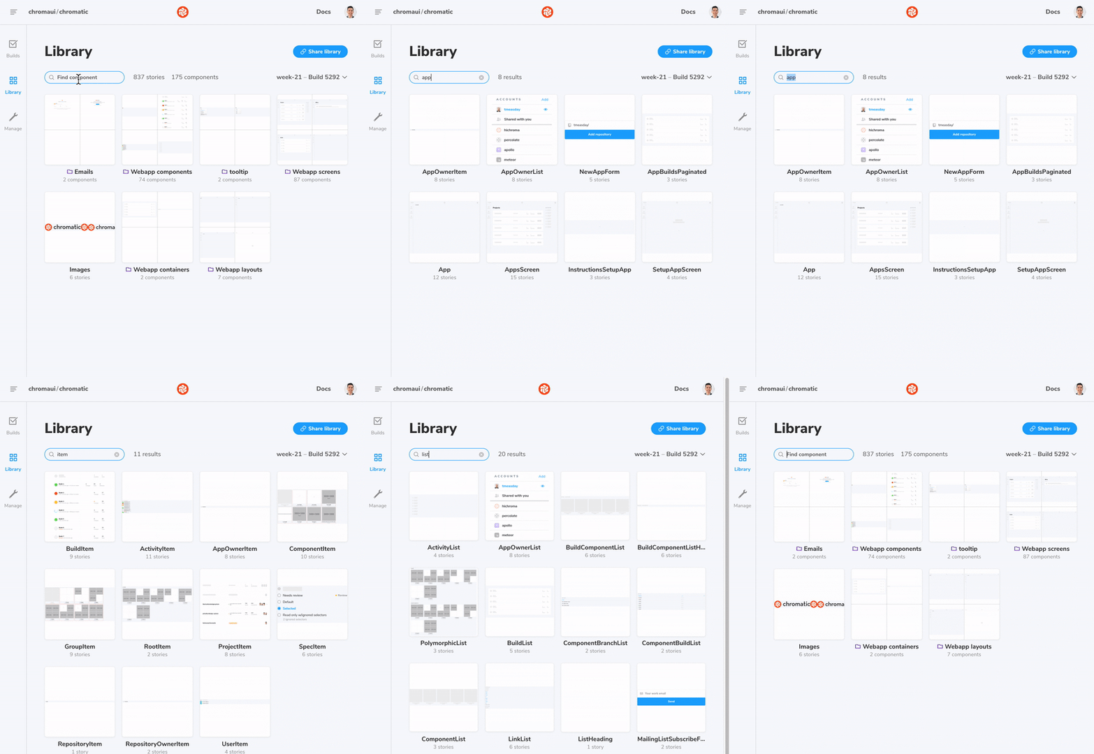
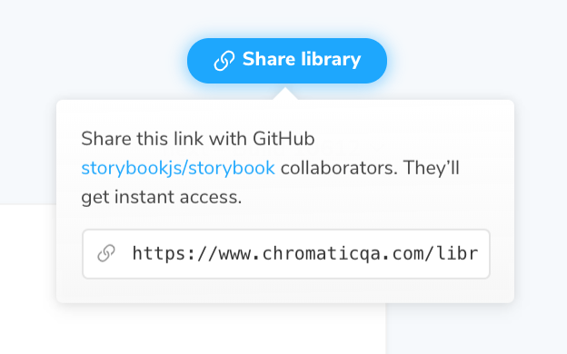
Share a link to your library to get help from your team when you find a bug or have a UI library question.
🎨 Built with the Storybook Design System

Storybook is among the top 40 JavaScript projects on GitHub. As the project grows, it has become harder to maintain a high quality user experience especially with 750+ contributors and counting.
We created Storybook Design System to ship durable UI components across the project. This saves contributors time by providing basic building blocks to reuse instead of reinventing the wheel. It’s now used by three properties (including Chromatic’s web app) that serve tens of thousands of developers. The design system uses Chromatic to prevent UI regressions.
View the Storybook Design System on GitHub
📦 New package v2.0.0
storybook-chromatic 2.0.0 defaults to building and uploading your Storybook, rather than starting and tunneling it. This has many benefits including increased reliability and better support for Live View.
You’ll need to ensure you have a build-storybook script defined in package.json (as added by the Storybook CLI). To get the old behaviour, pass -s to the chromatic test command.
New features:
- Support HTTPS storybooks (using the --ssl flag and friends).
- Polyfill the Intl in our JSDOM environment.
Chromatic for Storybook
Chromatic is an industrial-grade testing tool created by Storybook core maintainers. It’s used by frontend teams at Salesforce, Dropbox, Auth0 and more. Our goal is to help you ship bulletproof UI components with confidence.