Introducing Storybook Design System
A reusable UI component library for Storybook contributors

Update October 2019: Learn how to build a design system from scratch with a free 9 chapter guide Design Systems for Developers (includes real code commits!)
Storybook is the most popular component explorer on the planet. It’s used by 20,000+ GitHub projects and maintained by over 700 contributors.
As the team and project scale new UI challenges are unearthed. More developers means higher communication overhead. Established UI patterns fall through the cracks or are forgotten altogether. Contributors needlessly reinvent the wheel instead of building exciting features.
I’m thrilled to introduce Storybook Design System (SDS), a reusable component library that helps contributors build UIs faster. The goal is to make working on Storybook’s UI more productive and satisfying.
Why a design system?
A design system is a reusable component library that streamlines building complex yet consistent UIs. SDS saves you time and reduces ambiguity by codifying Storybook’s existing UI components in a central well-maintained repository. It contains three pieces:
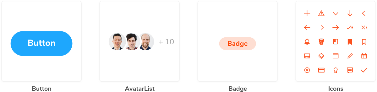
- 🏗 Component library: 25 production-grade functional UI components and 95 stories
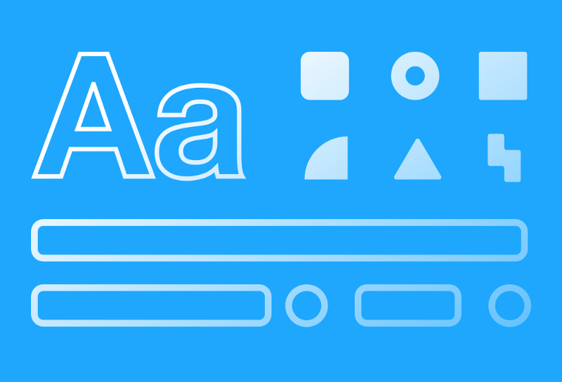
- 🎨 Design tokens: Style variables for the Storybook brand
- 📕 Documentation: Usage instructions and prop tables
Tens of thousands of developers already interact with SDS on Storybook’s website, Learn Storybook, and Chromatic (a visual testing tool by Storybook maintainers).
How we made the design system
Storybook is crucial to design systems from Uber, Airbnb, GovUK, IBM, GitHub, and Microsoft. When Kyle, Michael, and I set out to build SDS we first identified the common traits of successful design systems. Along the way, patterns emerged in how great teams build, test, and distribute UI components.
We then shamelessly cherry-picked the most effective techniques to ship SDS in less than two months. Here’s what we learned.
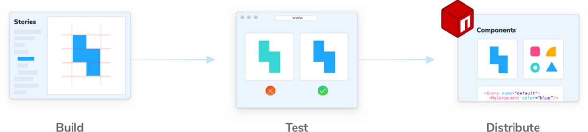
Build components
Tools we picked
- 📕 Storybook: Develop UI components in isolation
- 💅 Styled-components: CSS-in-JS library for scoping styling to components
- ✨ Prettier: Automatic code formatter
- 📐 ESLint: Linting utility for JavaScript
What worked
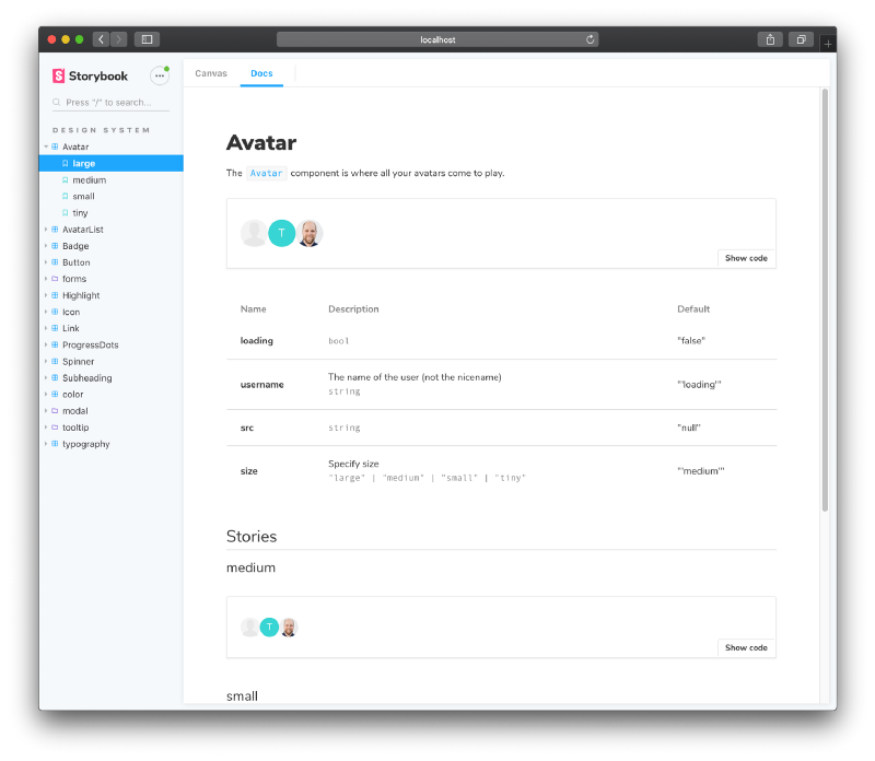
Every design system includes a reusable component library. We use Storybook for building components in isolation and cataloging the library. Storybook is supercharged with useful addons from the ecosystem.
- ♿ Accessibility: Realtime accessibility checking
- 💥 Actions: QA click and tap interactions
- 🎛 Knobs: Interactively adjust props to stress test components
- 📝 Storysource: View story code to paste it in your project
- 📕 Docs: Automatically generate documentation from stories
SDS design tokens (a.k.a., style variables) are exported along with the design system.
What didn’t work
We learned from the design system community that foregoing a component explorer is inefficient. Building your own component explorer is expensive. And trying to “document as you go” adds more writing overhead (unrealistic for our delivery schedule).
Storybook gives you a workshop built for components. You incrementally document by saving component variations as stories. With Storybook Docs, you get reasonable docs generated automatically. Later, you can add rich prose via Markdown, MDX, or inline comments.
Test components
Tools we picked
- 🚥 CircleCI: Continuous integration service that runs our test scripts whenever we commit.
- ✅ Chromatic Visual testing in the cloud that hooks into CI.
What worked
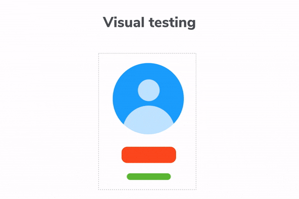
Design systems are both a single source of truth and a single point of failure. Improvements and bugs propagate to consumer apps with ruthless efficiency. Since SDS contains pure functional UI components, which are inherently visual, we needed a visual testing strategy.
Visual tests validate what users actually experience — the rendered UI. Each commit we screenshot every UI component in a consistent cloud browser environment. This allows us to diff against previous screenshots to automatically identify and fix bugs before shipping.
What didn’t work
Previous projects used Jest snapshot tests to catch changes in the component code. For UI, diffing code snapshots is noisy and prone to false positives so developers end up “accepting all” or ignoring them altogether.
Instrumenting behavioral validation with Enzyme or Cypress was overkill for atomic UI components.
Most component snapshot tests are really just a worse version of screenshot tests. Test your outputs. Snapshot what gets rendered, not the underlying (volatile!) markup.
— Mark Dalgleish (@markdalgleish) June 27, 2019
We use Chromatic by @chromaui, which takes screenshots of our Storybook stories. It's worked wonders for us.
Distribute the system
Tools we picked
- 🎁 NPM Package hosting and distribution
- ⚙️ Auto Simplifies publishing packages to NPM on merge (works with GitHub)
What worked
There is no right way to distribute a design system. Companies like Lonely Planet and Wix ship their design system as a single package, while Airbnb and Atlassian packages components separately.
SDS is distributed as a single versioned package to streamline the release process.
What didn’t work
While Lerna was considered to help ship multiple packages from one repo, adding it to the stack would introduce more maintenance and tooling complexity. SDS’s components are low-complexity. There are no DatePickers, Histograms, or spaghetti dependencies so we didn’t think adding more tooling was worth the extra work.
Get started
SDS components are written in React, and its stories are written in Component Story Format, now available in Storybook 5.2-beta.
Install and use
npm install --save @storybook/design-systemimport React from ‘react’;
import { Button } from ‘@storybook/design-system’;
export default { title: 'Button' }
export const example = () => <Button>Example</Button>;Browse SDS components in your own Storybook
Once you add the package, make sure your .storybook/config.js imports all files ending in .stories.js.
import { configure } from '@storybook/react';

configure(require.context('../src', true, /.stories.js$/), module);
Browse the Storybook for SDS
Clone the GitHub project then start Storybook
yarn && yarn storybookLearn with us
Storybook Design System was created by Kyle Suss, Dominic Nguyen (me!), and Michael Shilman with invaluable accessibility contributions from Jimmy Somsanith. It’s developed in the open so the community can learn from our mistakes and successes.
Contributions to SDS are very welcome. As a contributor, you’ll be introduced to emergent design system best practices from the community-at-large. In addition, you can demo bleeding-edge Storybook features and workflows without having to set them up yourself. We especially need help defining best practices for developer-oriented component documentation.
Want to learn how to build a design system?
I’m co-authoring a free 10-chapter design system tutorial on the Chroma blog with Tom Coleman, a fellow Storybook maintainer. New chapters and code samples will be released each week. Follow me on Twitter to get updates.
Contribute to Storybook
Storybook is the product of over 700 community committers and is organized by a steering committee of top maintainers. Thanks also to gracious donations on Open Collective.
If Storybook makes your UI development workflow easier, help Storybook get better. You can contribute a new feature, fix a bug, or improve the docs. Join us on Discord, support us on Open Collective, or just jump in on Github.