Design systems in Storybook
A streamlined workflow for frontend developers
Last week over 15,000 people checked out Design Systems for Developers, a free guide I cowrote about the frontend infrastructure underpinning design systems.
The guide’s surprising popularity is indicative of just how mainstream design systems have become amongst developers. In three short years since Brad Frost’s seminal book Atomic Design, design systems like Shopify Polaris, IBM Carbon, Salesforce Lightning, and Airbnb Lunar now power the frontend practice of countless engineers.
Design Systems for Developers examines how the smartest teams engineer design systems at scale and why they use the tools they use. This article summarizes the essential workflow outlined in the guide.

The blueprint we wish we had
Earlier this year Storybook maintainers and I set out to build a design system for Storybook. Yes, a design system for a tool that builds design systems. At the time, information about this area of frontend infrastructure was scarce. Even though plenty of design systems were open source, developers still had to spelunk through code to see how things worked.
Fortunately as Storybook maintainers, we were in an ideal position to research best practices from the entire Storybook community which includes thousands of projects.
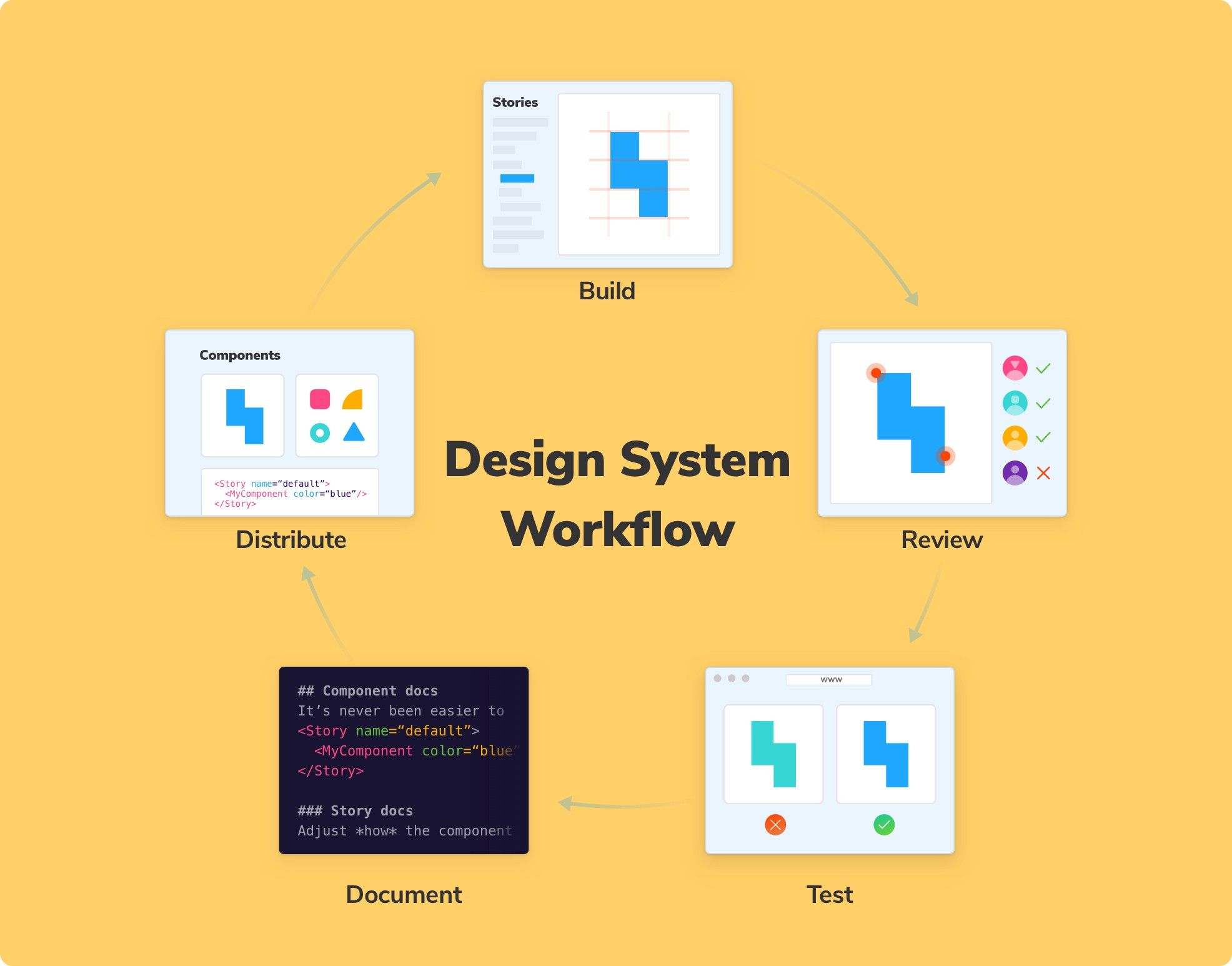
The research uncovered a five step workflow that balances low setup cost, time-saving automation, and convenient developer experience. It’s presented here in the abridged form to give you a head start on engineering design systems from scratch.

Building and maintaining a system isn’t a single discrete task. It’s a collection of jobs that must complement each other.
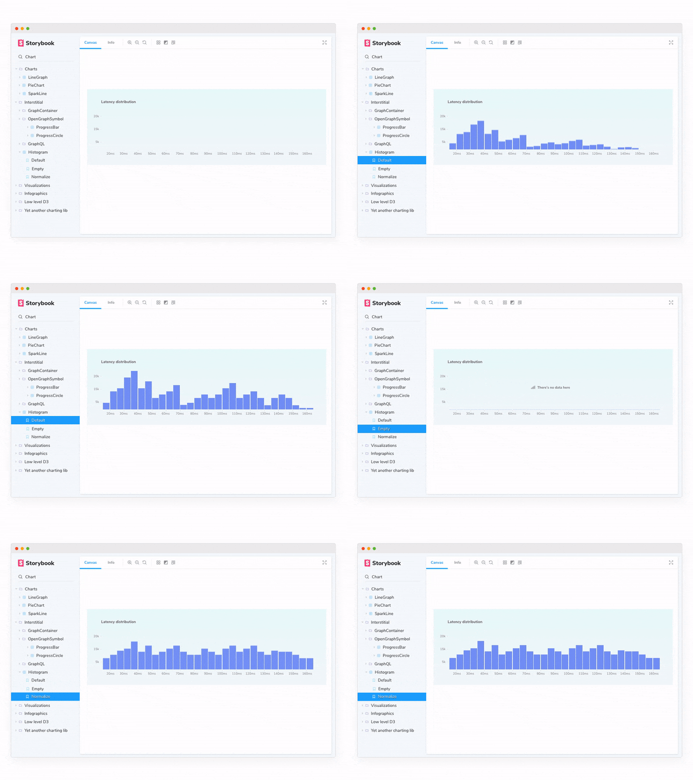
1. Build UI components in isolation
Design systems aren’t apps; they ship only production UI components. Use Storybook as a “workbench” to build UI components in isolation outside a consumer app. Then customize Storybook’s core functionality to your team’s needs with popular addons:
- Actions to verify interaction. Get UI feedback in Storybook when an action (click, hover, etc) is performed on an interactive element like a Button or Link.
- Source to view source code. View the underlying code in Storybook’s UI to understand how it works and paste it into your project.
- Knobs to explore component props. Interact with component props dynamically in the Storybook UI. That helps design system creators stress test components by adjusting, well, knobs.
2. Review to reach consensus and gather feedback
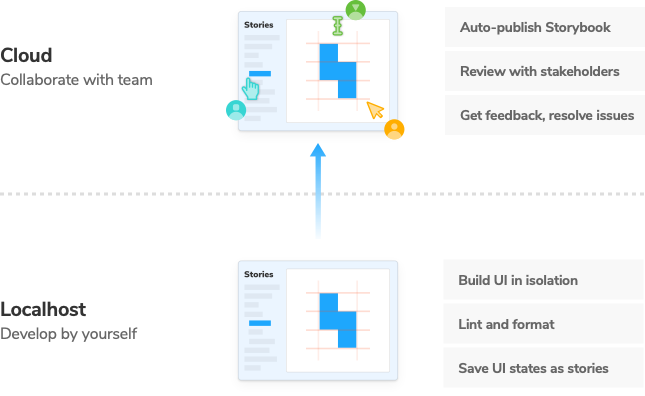
Design systems effect every product and feature in an organization. As such, they require alignment between developers, designers, product managers, and other disciplines.
The most effective way to reach alignment is to publish Storybook online regularly as a part of your CI process. For example, with Netlify, Now, or S3. That way all stakeholders have a universal reference point for UI implementation –all without touching code or command line.
3. Test to prevent UI bugs
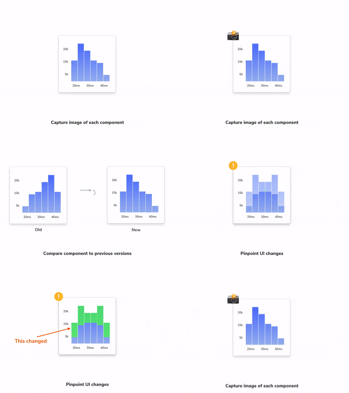
As a dependency of many apps, design systems are a single point of failure. Introducing UI bugs in common components snowballs into major regressions across projects. Prevent regressions by automating visual (e.g., Chromatic) and unit tests (e.g., Jest) to run whenever you push code.
Running code through a test suite gives your team the confidence that you’re shipping durable code to all client apps.
4. Document to accelerate adoption
It’s clear that documentation is invaluable. How else are folks supposed to learn your design system? But writing docs is often the last priority.
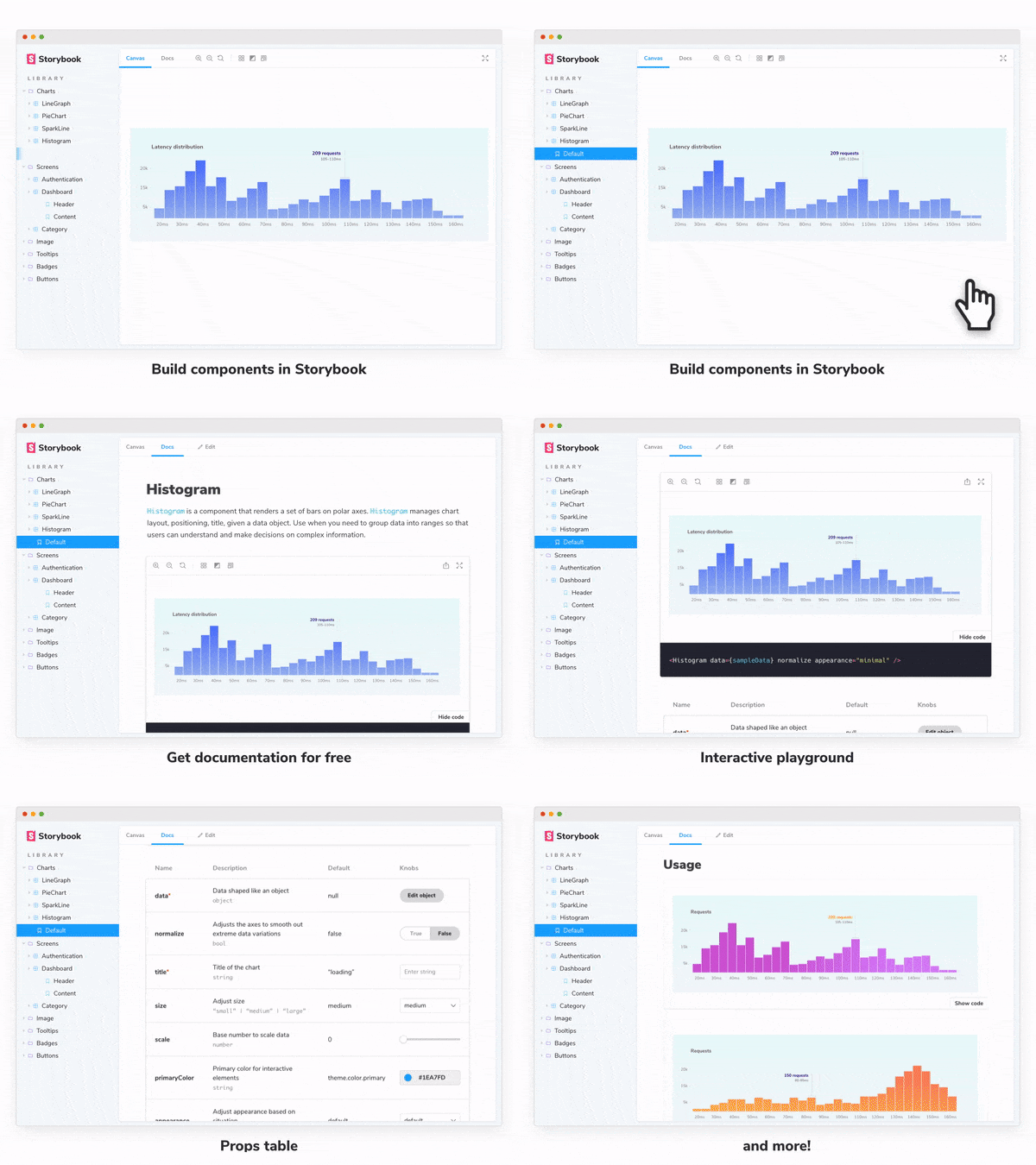
Make it easier on your team by auto-generating “minimum viable docs” which you can then customize later. With Storybook Docs addon you develop stories as normal and get UI documentation for free.
5. Distribute the design system to consumer projects
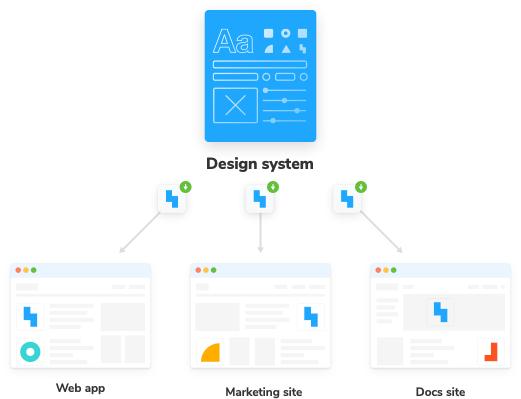
Now that your UI components are durable, peer-reviewed, regression-tested, and documented, you need a mechanism to distribute them to other teams.
Design systems are distributed as versioned packages via a package manager (e.g., npm). Smart teams further streamline this process using a release management tool like Auto that allows you to seamlessly release new versions from your GitHub workflow.
Savings over time
Products change, users change, design systems change too. A workflow is a standardized repeatable process for delivering good work. Over a design system’s life, teams ship countless updates. Mastering the workflow makes constant improvement satisfying and painless.
What’s more, streamlining the developer experience of common tasks now yields large time savings in the future.
By the numbers, code reuse has the potential to accelerate projects 42–81% and increase productivity by 40%. Design systems help companies reuse user interface code. It’s no wonder they’re gaining popularity in the development community.
I hope distilling common-sense tactics into a pragmatic workflow helps you create a thriving design system of your own. Let this be your launching point.
👉 Read the full guide Design Systems for Developers
Learn more
Design Systems for Developers was produced by Chroma and co-authored by Dominic Nguyen (me!) and Tom Coleman. InVision’s Design Forward Fund provided a grant to kickstart this guide (thank you!). Want to learn more about Storybook workflows from the folks who build Storybook? Checkout these articles:
- 🔄 Delightful Storybook workflow: We surveyed developers from Squarespace, Discovery Network, and Major League Baseball to find a streamlined UI development workflow
- 📚 UI Component Playbook: A 5-step guide to designing and engineering frontends with components.
- ✅ Visual testing with Storybook: UIs bugs are more annoying and expensive than ever. Learn how to teams at Slack, Lonely Planet, and Walmart test the appearance of modern UIs to save time.