How to publish a Storybook addon
Share your Storybook addon with the community

In the last post, you got an overview of the addon APIs and built your first addon. To share this addon with other Storybook users, you need to package and publish it.
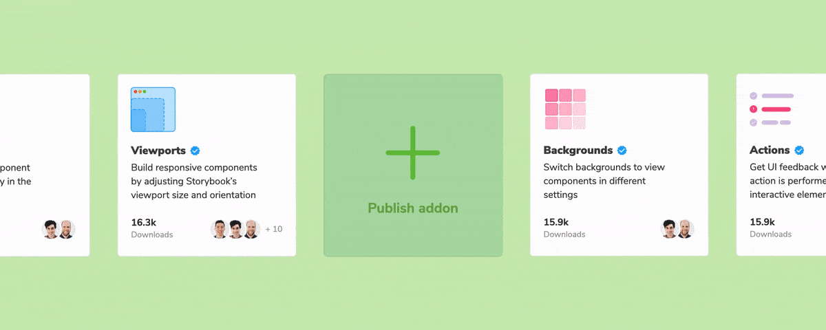
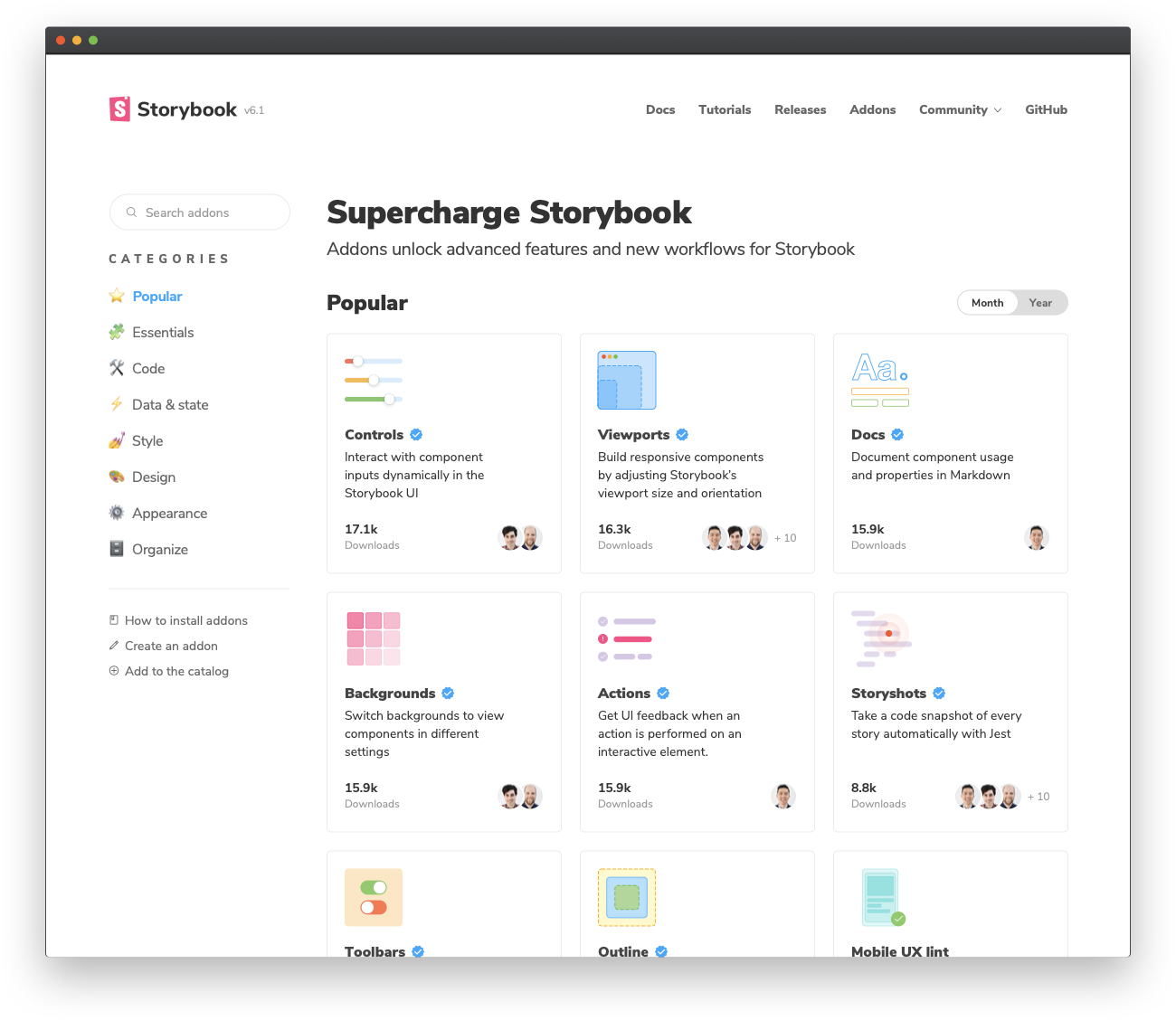
The Addon Catalog is the home of all Storybook addons. It’s where we showcase your addons and how developers discover new ones. This post shows you how to prepare your addon for release, package it up, and publish it to the catalog.
Preparing your addon for release
Storybook addons, like most packages in the JavaScript ecosystem, are distributed via npm. However, they have certain criteria:
- Have a
distdirectory containing transpiled ES5 code - A
preset.jsfile at the root level, written as an ES5 module - A
package.jsonfile that declares:- Peer-dependencies
- Module related info
- Catalog metadata
Let’s go through and tackle these one by one.
Build system
You’re likely to write your addon code using ES6 and rely on features like JSX. Therefore, the addon code needs to be transpiled down to ES5. There are many ways to do this. My recommendation is to set up a build system using the Babel CLI. You can install it by running:
npm install --save-dev @babel/core @babel/cliBabel is a flexible tool. It transpiles all kinds of new JavaScript features or framework specific features into ES5. We rely on predefined and community managed Babel presets to manage all these features for us.
npm install --save-dev @babel/preset-env @babel/preset-reactHere, preset-env is responsible for the latest JavaScript features and preset-react manages React specific features such as transforming JSX. Add a .babelrc.js at the root of your project and configure it to use these presets.
// .babelrc.js

module.exports = {
  presets: ['@babel/preset-env', '@babel/preset-react'],
};
And let’s define a few build related scripts.
// package.json

 "scripts": {
   "clean": "rimraf ./dist",
   "build": "babel ./src --out-dir ./dist",
   "storybook": "start-storybook -p 6006",
   "start": "concurrently \"npm run storybook\" \"npm run build -- --watch\"",
   ...
 },
Running npm run build will output the ES5 code to the dist directory. While running npm start will run the Babel CLI in watch mode and simultaneously start Storybook. The watch mode is super handy for local development. On every save it’ll rebuild the addon and refresh Storybook.
Root level preset
The second requirement is to have a root level preset. Our addon uses a preset, defined at src/preset.js. Let’s create a preset.js file at the root of the project which uses the dist output instead:
// preset.js

module.exports = require('./dist/preset');
You should also update the Storybook config to use this root level preset.
// .storybook/main.js

module.exports = {
  stories: [
    '../stories/**/*.stories.mdx',
    '../stories/**/*.stories.@(js|jsx|ts|tsx)',
  ],
  addons: ['@storybook/addon-essentials', '../preset.js'],
};
Module Metadata
Next, we need to declare a few key pieces of information about the addon in the package.json file. This includes the main entry point for the module and which files to include when you publish the addon. And any peer-dependencies that you might have — at the very least react and react-dom.
// package.json

"main": "dist/preset.js",
"files": [
 "dist/**/*",
 "README.md",
 "*.js"
],
"dependencies": {
  "@storybook/addons": "^6.0.0"
},
"peerDependencies": {
  "react": "^16.8.0 || ^17.0.0",
  "react-dom": "^16.8.0 || ^17.0.0"
}
Why peer-dependencies? Let’s say you are building a form library that works with React. If you include React as a dependency then the React code will be packaged along with your library. Your users already install React within their codebase. If that happens to be a different version then, it’ll cause their app to break. It’s the same idea here.
Catalog Metadata
Along with the module related info you also need to specify some metadata for the Storybook Addon Catalog.
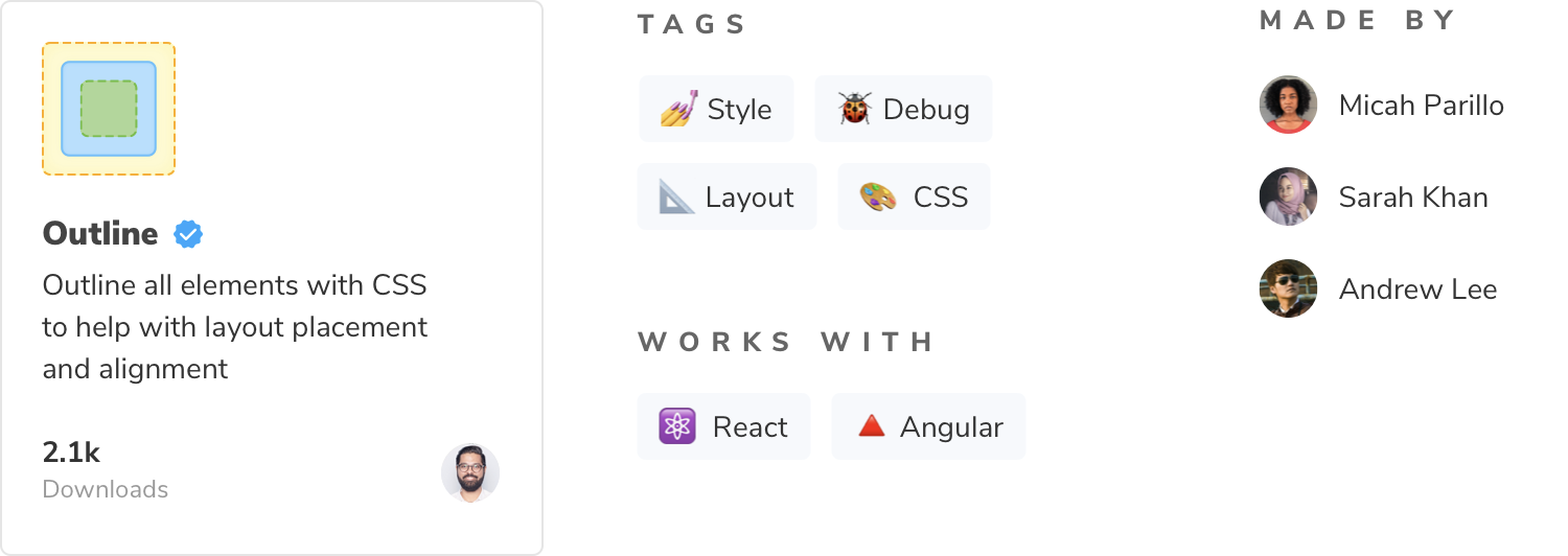
Some of this info might already be available in package.json since you need to provide that to npm. For example, the addon name, description, author info. The rest is provided via the storybook property. Things like a display name, icon or a list of supported or unsupported frameworks. For the complete specification of the metadata API check out the Addon metadata documentation.
// package.json

"name": "storybook-addon-outline",
"version": "1.0.0",
"description": "A storybook addon for visually debugging CSS layout and alignment",
"author": "winkerVSbecks",
"storybook": {
 "displayName": "Outline",
 "unsupportedFrameworks": ["react-native"],
 "icon": "https://yoursite.com/outline-icon.png",
},
"keywords": [
 "storybook-addons",
 "style",
 "outline",
 "css",
 "layout",
 "debug"
],
The keywords property here maps to catalog tags. For example, the storybook-addons tag ensures that your addon will get into the catalog. And appearance is a top-level category. The rest help with searchability of your addon.
Publishing to NPM
Let’s quickly review what we’ve done so far. We set up a build system to transpile the addon code to ES5. Added a root level preset. And defined module and catalog related info in the package.json file. The last step is to actually publish the addon.
The addon will be published to the npm registry. Ensure that you have signed up for an npm user account and run:
npm version 1.0.0 -m "Created first version of the Outline addon: %s"
npm publish
There you have it! We’ve successfully published our package to npm and released our first Storybook Addon. You can check out the official Outline addon in the catalog.
Conclusion
Addons help the community customize and automate Storybook. Publish your addon to share it with thousands of devs. I’m excited to see what you build!
Note, there may be a delay in your addon showing up in the catalog because it crawls npm. If your addon isn’t showing up, please file an issue on the catalog repo.
For a deep dive into package publishing, checkout the Distribute UI across an organization chapter from Design Systems for Developers. It covers topics such as generating changelogs and automating releases.