Visual Test Driven Development
How component explorers enable test-driven UI development

Developing user interfaces has always been a bit of an art. The visual and subjective nature of the medium led to an ad-hoc and ill-defined development process. This lack of process makes it hard for developers to build truly excellent UIs quickly.
Building from the component up forms the core of a solution to the problem. Better yet, if your entire team is on board, you can achieve one of the most rigorous development processes, which is otherwise impossible for UIs: Test Driven Development (TDD).
In this post, I’ll talk about how component explorers, which enable “visual” testing, also unlock the ability to build modular and extensible UIs in a test-driven fashion.
Visual TDD applies the test-driven development process to UI components. It uses a cast of supporting tools that enable a TDD-style workflow to make a methodology that was once cumbersome dead simple.
Test Driven Development
One of the key advantages of modularization is test driven development (TDD). The idea of TDD is that you write your tests first, before you write the functionality under test.
Practically, TDD is the process of first constructing a set of automated tests for your code and second writing the code itself to “turn the tests green”.
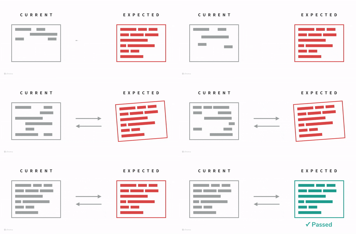
TDD allows you to think clearly about what your code needs to do in terms of concrete inputs (for components, we refer to these as “states”), and makes it easy to cover all use cases of your module. You can read more about it in many places, but James Shore’s post on the subject is a good start.
TDD is really great for well defined modules with clear inputs and outputs. For instance, if you are writing a relativize function that converts a date object to a string of the form “2 weeks ago”, it’s pretty straightforward to outline all the various types of input you want to cover and just hit the “test” button each time you think you’ve made progress toward a solution. Your test framework allows you to run the relativize function in isolation, without needing to provide input for your entire application just to test that one part.
However, TDD falls down when it’s hard to define unit tests ahead of time, when your module is hard to isolate, and your outputs are hard to predict ahead of time. This is exactly the case for UIs without visual testing.
Visual Testing
Visual testing is an approach to bypass the complexity of testing UIs by involving a human’s judgement in a quick and focused fashion. You can read more about it on my previous post on the subject.
The essential complexity of testing UI’s is that it’s not usually possible to express the relevant visual details of interfaces through verification code.
In practice, visual testing uses a component explorer to manually and “visually” test a component across a set of defined test states. Although component explorers are useful for many stages of development process, from communicating designs to listing components for re-use, testing the behavior of a component in a given state is chief amongst them.
To write visual test, we simply outline the state of the component we are interested in. In React Storybook, a component explorer for React, we might write:
storiesOf('Task')
  .add('inbox task', () => (
    <Task task={{
      title: "Test Task",
      subtitle: "on TestBoard",
      state: "TASK_INBOX"
    }} />
  ));
Task.story.js
Then we can view the task in the explorer.
What we have produced above corresponds to the “execute” phase of a test cycle; the “verify” phase we do by eye. For UI testing, verifying manually is sometimes the best approach as it is robust to irrelevant changes to the component. Additionally, because we only need to write our inputs ahead of time and we can visually check the output, we tend to automatically build UIs in a TDD style.
Visual TDD
If you are building an app from a well thought out design, chances are that there are a set of well specified components with inputs and outputs embedded in the design artifact.
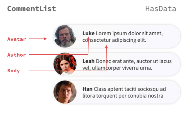
Pair this “design spec” with the visual testing process we’ve outlined above and you can run an exact analogy to pure TDD.
In the same way that visual testing requires a human element, visual TDD is “impure” in that you need to manually decide if a given test spec is passing. However most of the key advantages of TDD carry over:
- You clearly specify a set of inputs to the component that cover all interesting use cases. This can often lead you to think about use cases that you wouldn’t consider if you developed it in a more ad-hoc way.
- As you make progress to the solution, you can quickly and easily see how it performs under each spec.
- The set of specs survive the development process, and can be used to build a set of regression tests (to be done manually, perhaps optimized by snapshot testing).
Resistance chat tool — an example
Suppose we are tasked with building out the CommentList, part of a chat tool for galactic freedom fighters.
Let’s say our designer has handed us a design for the various ways the list of comments should look depending on the data and the state of the app:
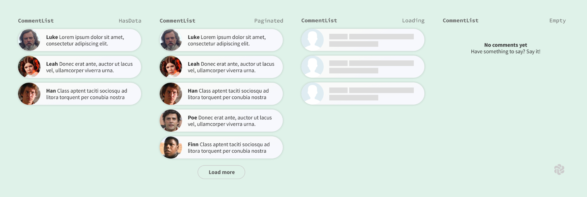
We need to ensure the list renders correctly in terms of the exact text, images displayed, and visual treatment.
Step 1: Building test cases
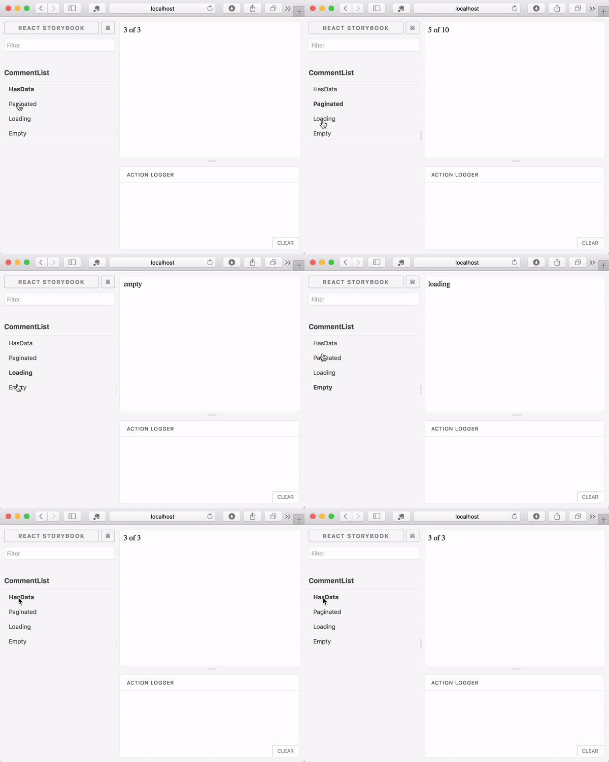
To start TDD we need to build test cases. We’ll build four cases that match with the four images we’ve been handed above (a strict TDD-er would say we need to build and implement one test case at a time; it’s up to you if you think this helps your process).
We are going to use React Storybook for this example, although it works equally well with any component explorer. If you are following along at home, jumpstart an app with Create React App and React Storybook using the following commands:
# Install binaries if needed
npm install --global create-react-app getstorybook

create-react-app commentlist
cd commentlist
getstorybook
Next we’ll build a simplest-possible CommentList implementation, just so we can ensure our tests are setup right. We can put the following in src/CommentList.js:
import React from 'react';

export default function({loading, comments, totalCount}) {
  if (loading) {
    return <div>empty</div>;
  }

  if (comments.length === 0) {
    return <div>loading</div>;
  }

  return <div>{comments.length} of {totalCount}</div>;
}
CommentList.js
Then we build our test states. React Storybook makes this quick and easy. In the default setup, we’d place this file at src/stories/CommentList.js and include it from src/stories/index.js:
import React from 'react';
import {storiesOf} from '@kadira/storybook';

import CommentList from '../CommentList';

storiesOf('CommentList', CommentList)
  .add('HasData', () => (
    <CommentList comments={testComments.slice(0, 3)} totalCount={3} />
  ))
  .add('Paginated', () => <CommentList comments={testComments} totalCount={10} />)
  .add('Loading', () => <CommentList loading={true} />)
  .add('Empty', () => <CommentList comments={[]} />);

const testComments = [
  {
    text: 'Lorem ipsum dolor sit amet, consectetur adipisicing elit.',
    author: {
      name: 'Luke',
      avatar: 'luke.jpg',
    },
  },
  {
    text: 'Ut enim ad minim veniam, quis nostrud exercitation ullamco laboris.',
    author: {
      name: 'Leah',
      avatar: 'leah.jpg',
    },
  },
  {
    text: 'Duis aute irure dolor in reprehenderit in voluptate.',
    author: {
      name: 'Han',
      avatar: 'han.jpg',
    },
  },
  {
    text: 'Ut enim ad minim veniam, quis nostrud exercitation ullamco laboris.',
    author: {
      name: 'Poe',
      avatar: 'poe.jpg',
    },
  },
  {
    text: 'Duis aute irure dolor in reprehenderit in voluptate.',
    author: {
      name: 'Finn',
      avatar: 'finn.jpg',
    },
  },
];
CommentList.js
Step 2: Check the tests in storybook
If we have the above setup right, and we run it with npm run storybook, we should see the four test states at http://localhost:9009:
Step 3: Build out the implementation
Let’s start by building an implementation of the HasData state in a self contained way. We’ll be using using styled-components — a CSS encapsulation library that allows proper style isolation at the component level.
We can add styled-components with a simple npm command: npm add --save styled-components.
Now we can try an implementation of the main list that handles the HasData use-case:
import React from 'react';
import styled, {injectGlobal} from 'styled-components';

injectGlobal`
  @import url('https://fonts.googleapis.com/css?family=Nunito+Sans:400,400i,800');
`;

const CommentListDiv = styled.div`
  font-family: "Nunito Sans", "Helvetica Neue", Helvetica, Arial, sans-serif;
  color: #333;
  display: inline-block;
  vertical-align: top;
  width: 265px;
`;

const CommentItemDiv = styled.div`
  font-size: 12px;
  line-height: 14px;
  clear: both;
  height: 48px;
  margin-bottom: 10px;
  box-shadow: rgba(0,0,0,.2) 0 0 10px 0;
  background: linear-gradient(120deg, rgba(248, 248, 254, .95), rgba(250, 250, 250, .95));
  border-radius: 48px;
`;

const AvatarDiv = styled.div`
  float: left;
  position: relative;
  overflow: hidden;
  height: 48px;
  width: 48px;
  margin-right: 14px;
  background: #dfecf2;
  border-radius: 48px;
`;

const AvatarImg = styled.img`
  position: absolute;
  height: 100%;
  width: 100%;
  left: 0;
  top: 0;
  z-index: 1;
  background: #999;
`;

const MessageDiv = styled.div`
  overflow: hidden;
  padding-top: 10px;
  padding-right: 20px;
`;

const AuthorSpan = styled.span`
font-weight: bold;
`;
const TextSpan = styled.span``;

export default function CommentList({loading, comments, totalCount}) {
  if (loading) {
    return <div>empty</div>;
  }

  if (comments.length === 0) {
    return <div>loading</div>;
  }

  return (
    <CommentListDiv>
      {comments.map(({text, author: {name, avatar}}) => (
        <CommentItemDiv>
          <AvatarDiv><AvatarImg src={avatar} /></AvatarDiv>
          <MessageDiv>
            <AuthorSpan>{name}</AuthorSpan>{' '}
            <TextSpan>{text}</TextSpan>
          </MessageDiv>
        </CommentItemDiv>
      ))}
    </CommentListDiv>
  );
}
CommentList.js
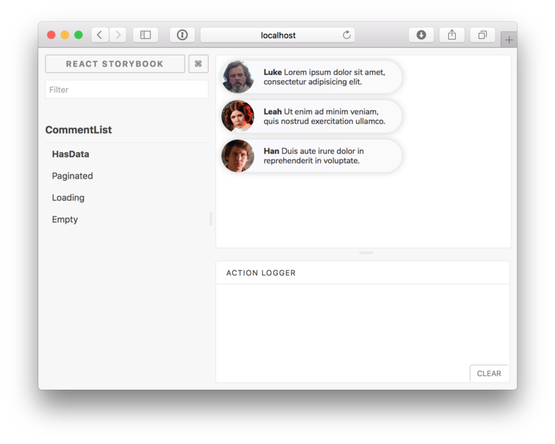
Step 4: Check the implementation against the design
Once we’ve worked on our implementation a little bit we can open it up in storybook to see if it works. Of course, this example was heavy on CSS, so chances are we will have been testing our changes in storybook as we went to tweak the styles to achieve what we wanted (it’s hard to show that process in a blog post but hopefully you get the idea!).
Step 5: Iterate
If we were unhappy with our implementation in step 4, we could go back to step 3 and keep working on it. If we’re satisfied, then it’s time to build the next state. Perhaps we’d tackle the Paginated test state, and try to add the “load more” button.
As we iterate through this process, we should keep checking each state to ensure that our final implementation properly handles all of our test states (not just the last one we worked on!)

Visual TDD and Component-Driven Development
The process of starting with visual specifications and building out a component from them is one piece of a general movement toward the Component-Driven Development methodology. Early in your development, the whole team decides on a set of components and builds the app “bottom up” — starting with the smallest components and working towards the screens.
Component-Driven Development turns an ad-hoc development process into a clearly defined methodology for building each component out in full in isolation. Separation of concerns in development is a key step forward in modularization which result in concrete benefits like parallelizing development and improving code quality.
Whether or not you follow a rigid TDD process or you just enjoy (finally!) writing visual test for your components as you build them, I have no doubt when you try a component explorer and start building components in isolation, you’ll see the benefits.
Although there is more to CDD than simply enabling Visual TDD, hopefully this article has inspired you to try Visual TDD when building your next app or feature. I’m confident you’ll be hooked.
Chroma is a staunch advocate of the CDD process. We are exploring the implications of a world where frontends are built one component at a time, and we like what we are seeing. If that sounds interesting to you, sign up for our mailing list to discover many more articles on the topic. Do us a favor and recommend this article.