
Why appearances matter when sharing components
Best practices for building consistent UIs by reusing components

Designers and developers waste time reinventing components because it’s difficult to find existing components. The dissatisfying discovery experience results in a disinclination to spend effort even trying to reuse components. To encourage component reuse teams must first ensure that components are easily discoverable. Let’s find out what it takes.
Appearance is everything
UI components are fundamentally visual objects. The essential complexity of user interface engineering resides in the intricacies of how 0’s and 1’s render to the human eye. Unlike an easily verifiable function, a UI component requires your eye to check for “correctness”. The first step to discovering components is to render them for the human eye.
Unfortunately, most UI components are tied to the context of app logic. The app logic must be run to actually render the component. For the purposes of reusability, it puts a burden on developers because they have to execute the business logic just to glance at a component. This is unfeasible for large teams who work on disparate branches for the same app. In addition to rendering components, they must also be isolated from context or development environment to be discoverable.
Surface states
Relying only on inputs like props or arguments for rendering gives components the flexibility to be reused in many environments. However, this presents a discoverability problem because each input may accept a wealth of values. This in turn yields an overwhelming number of ways that the component can be visualized. How do you determine which values a component actually supports, and which are safe to ignore?
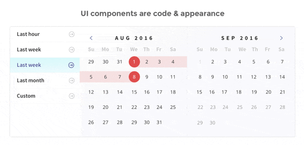
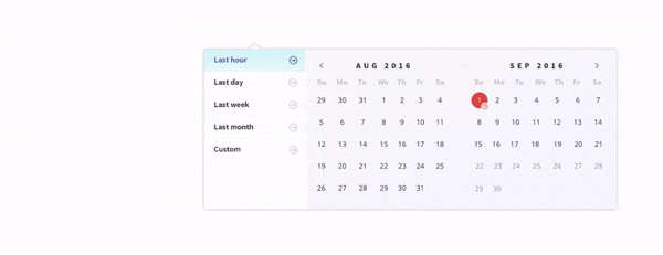
A component state describes a set of inputs associated with an expected appearance. It’s a reasonable abstraction that is representative of the most common cases. Documenting expected component states is a pragmatic way of helping colleagues quickly judge whether a UI component fits their needs.
Catalog components
Patterns naturally emerge when building user interfaces: header, dropdown, overlay, listItem, avatar. You’ve likely encountered these in almost all codebases.
For consistency an organization is incentivized to share common interface patterns. The problem is that they’re difficult to find. An app might have hundreds of discrete components, some that fetch data or rely on their environment and thus are not reusable, some that are presentational and probably are reusable. The challenge is indexing which of these can be used by others. Similar to a library of books, cataloging your components helps people find what they’re looking for.
What to do about discoverability
Solving discoverability promotes reuse within your organization. Once a UI component is visualized, documented, and cataloged it’s imminently easier to share. Luckily, a tool can help.
Component explorers — your new favorite tool
A component explorer is a tool for building UI components. The humble component explorer is a low-effort solution to surfacing components to be used by others. It lives alongside your app in development and does a couple of things:
- Visualizes components to be built in isolation of app logic
- Simulates test states
- Indexes the UI components in your app
Try a component explorer
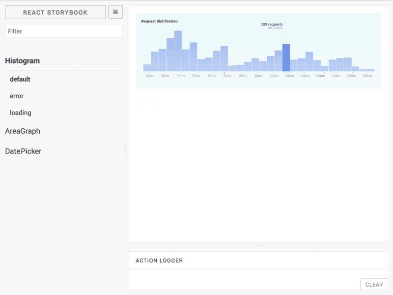
Component explorers exist for many view layers. If you’re looking to see one in action, follow the instructions below to get a TodoMVC demo app preconfigured with the React Storybook component explorer.
git clone https://github.com/kadira-samples/react-storybook-demo.gitnpm installnpm run storybook- Navigate to http://localhost:9001
Final words
Teams shouldn’t waste time on custom components when they can reuse existing components. The primary barrier to reuse is discovery –the basics of finding components. Using a component explorer to visualize, document, and catalog reusable UI is a practical solution that does the discovery legwork so you don’t have to.
Chroma is a big proponent of component reuse. No one should have to rebuild the same UIs. We’re exploring a world where frontends are assembled from reusable components and are excited about our findings. If that sounds interesting to you, sign up for the mailing list to discover more articles on the topic.