Storybook Composition
Combine multiple Storybooks into one

Scaling component libraries is tough.
Mature companies maintain hundreds of components scattered across separate Storybooks. Different teams build their own libraries with custom requirements and dependencies.
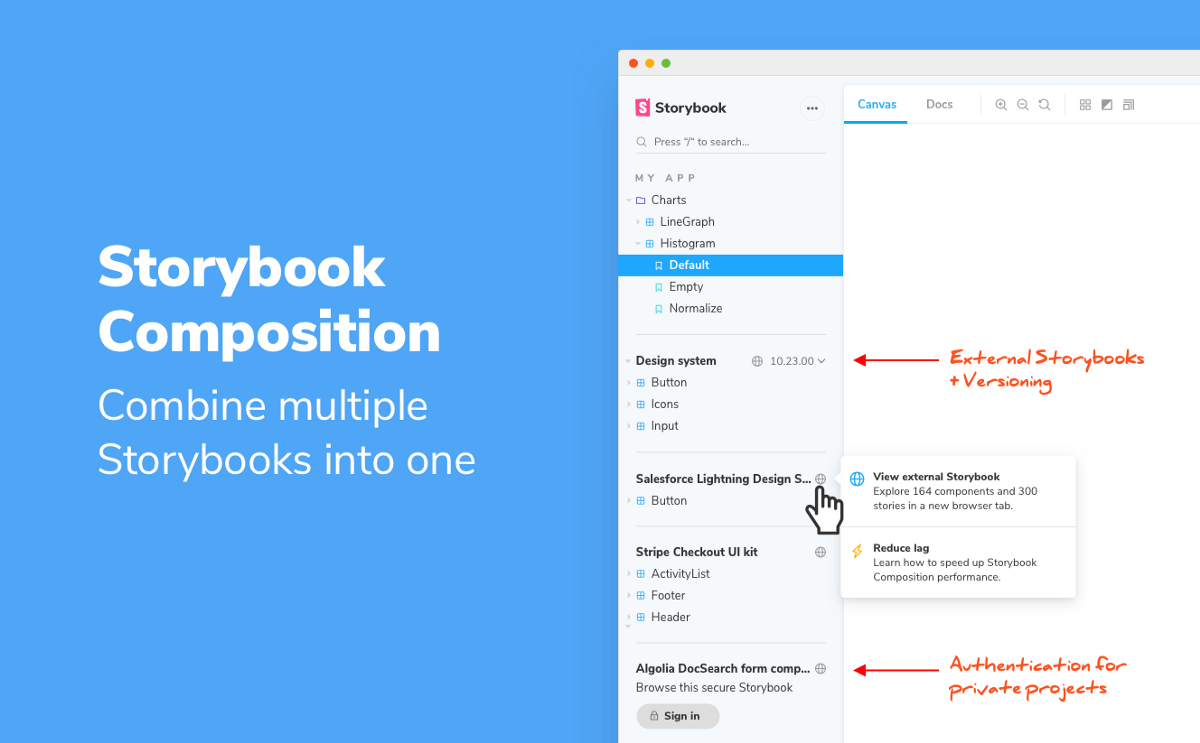
Storybook 6.0 introduces Composition, a new feature that allows you to browse components from any Storybook inside your local Storybook.
- 📚 Combine multiple Storybooks into one
- 🌐 Browse components from different frameworks side-by-side
- ⚡️ ️Faster developer experience for large Storybooks and monorepos
Wait, but why?
It’s exhausting to keep track of components. And the more components you have the more exhausting it becomes.
We interviewed teams at IBM, Cisco, and the Storybook community-at-large. It’s clear that mature companies have multiple Storybooks; usually one for each project.
The ideal developer experience is to interact with all Storybooks together at once. But this requires every project to have the same tech stack. That’s not feasible for large companies with multiple products.
Instead, developers jump between different Storybooks to reference and reuse components. The process is cumbersome so developers avoid it. In the end, this leads to a disjointed user experience.
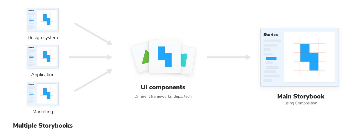
Combine Storybooks
Composition enables you to combine Storybooks. Our goal is to unify the Storybook experience for all components, no matter the view layer, tech stack, or dependencies.
The core innovation is the ability to reference external Storybooks inside your own Storybook. This unlocks common workflows that mature teams often struggle with.
- 👩💻 UI developers can quickly reference prior art without switching between Storybooks.
- 🎨 Design systems can expand adoption by composing themselves into their users’ Storybooks.
- 🛠 Frontend platform can audit how components are used across projects.
What’s more, Composition enables you to split heavy Storybooks into many lighter weight Storybooks but maintain a unified browsing experience.
How it works
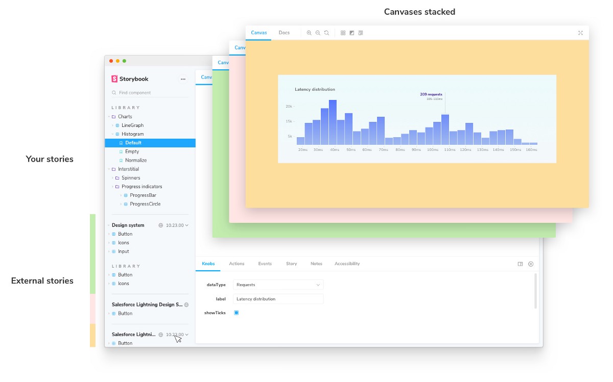
Storybooks are composed in your browser. Composition does not touch code, webpack, or any project-specific configuration.
All you need is the URL of a live Storybook. We use that URL to extract the stories list and the Canvas iframe. When Storybook is loaded in the browser it combines all the stories and stacks the Canvases on top of each other in the UI.
When you click on an external story, Storybook swaps in the external Canvas for that story. All of this happens behind the scenes; you have a seamless experience whether you’re interacting with a local or external story.
Try it now
Let’s demo Composition by adding an example Storybook to your project. We’ll use the open source Storybook Design System for this example. You can use any Storybook published online or running locally.
First upgrade to the latest Storybook.
npx sb upgradeIn your main.js file add a refs key with information about the reference Storybook.
Pass in a URL to a statically built Storybook. We’re using a permalink from Chromatic, a free Storybook publishing service made by the core maintainers (including me!).
//.storybook/main.js

refs: {
 design-system: {
   title: "Design System",
   url: "https://5ccbc373887ca40020446347-yldsqjoxzb.chromatic.com"
 }
}`
Now run Storybook. If it’s already running you’ll need to restart.
yarn run storybook🎉 Congrats! You’ll see our design system’s components in your stories list. Use the same technique to compose your Storybooks (5.3+). Make sure the Storybook you want to compose is published somewhere online first.
Compose local Storybooks
You can also compose Storybooks that are running locally. For instance, if you have a React Storybook and Angular Storybook running on different ports.
//.storybook/main.js

refs: {
  react: {
    title: "React",
    url: 'http://localhost:7007'
  },

  angular: {
    title: "Angular",
    url: 'http://localhost:7008'
  }
}
Perfect for design system and UI library authors
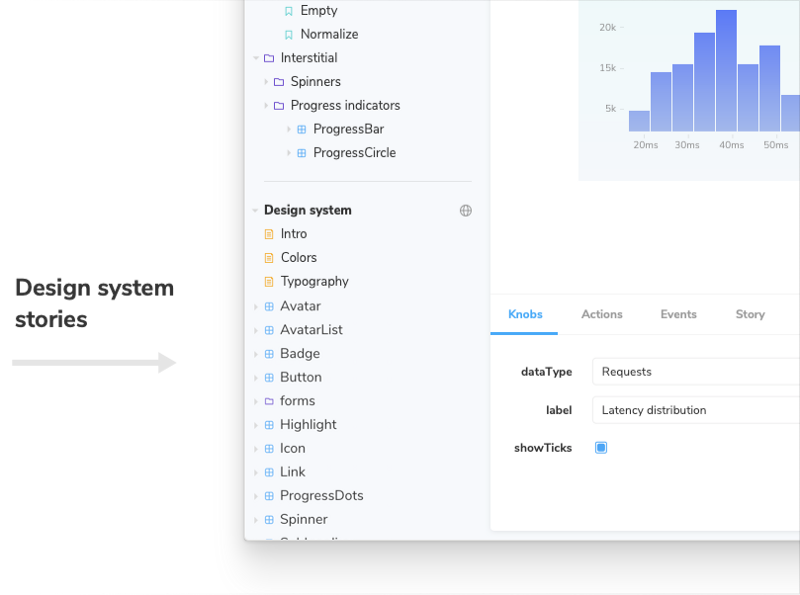
Design system authors can automatically compose their design systems inside their consumer’s Storybooks. If you ship your design system as a package, include the following in your package.json.
// Your design system's package.json

"storybook": {
  "title": "Storybook Design System",
   url: "https://5ccbc373887ca40020446347-yldsqjoxzb.chromatic.com"
}
This metadata tells package consumers where the published Storybook is located. When a consumer runs their Storybook, it will navigate to the URL, find the components, and load them into the stories list. Here’s a code example of this method.
Get involved
Storybook Composition was developed by Norbert de Langen, Tom Coleman, Michael Shilman, and Brody Mckee. Design and theming by Dominic Nguyen (me!).
If you have an implementation question or suggestion come chat with us in Discord. A maintainer is usually online.
Storybook is maintained by 1000+ open source contributors and guided by a steering committee of top maintainers. If you are interested in contributing, check out Storybook on GitHub, create an issue, or submit a pull request. Donate on Open Collective.