What you need to know about Storybook 3.0
Getting up to speed with the new React Storybook

Today marked an important milestone in the Storybook project: the release of version 3.0. It is the first release by the new community-lead organization formed around the project.
In this post I’ll cover what you need to know to get up to speed on Storybook 3.0. That includes a little history, what 3.0 signifies, and where the project is going.
What is Storybook?
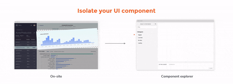
Storybook is a Component Explorer, or “Component Development Environment”. This means that it is a tool that allows you to build your apps one component at a time. The idea is that you define “stories” or states of your component and the tool allows you to visualize and interact with that single state in isolation.
storiesOf('Task')
  .add('inbox task', () => (
    <Task task={{
      title: "Test Task",
      subtitle: "on TestBoard",
      state: "TASK_INBOX",
    }} />
  ));
We at Chroma have written extensively about the benefits of this style of development, and you can read more on our blog, but suffice to say many developers, including cutting edge teams at Airbnb, Coursera and Slack are using Storybook to level up their front end development.
Storybook is also known as “React Storybook” because it works with React and React Native components. However this may change soon! (see the future section below).
What has changed about Storybook?
In the introduction I mentioned that the new release is a key milestone for Storybook because it marks the transition to a community maintenance model.
The story (pun intended) here is that Storybook was first developed by the team at Kadira, a Sri Lankan startup well known in the Meteor community for the eponymous application monitoring tool. Kadira was led by the prolific and inspiring Arunoda Sisiripala, and after recognising the benefits of React and component isolation early on, built a thriving and growing community around the tool.
However, due to personal and professional reasons, Kadira disbanded at the start of the year. With the core maintainers pursuing other projects a quiet period followed.
In the meantime, the Storybooks continued to pick up steam and adoption in teams around the world. It wasn’t long until a GitHub issue was opened: “Is this project dead?” which prompted a flurry of volunteers to help with maintenance. A team formed, led by Norbert de Langen and Michael Shilman, to gracefully transition to community maintenance. (We at Chroma are excited to help out as part of the maintenance team too!)
You can read more about the history in Michael’s post on the subject.
What’s community maintenance all about?
A lot of the effort in the month or two since then has focussed on laying the foundations for future community-led maintenance. This has included:
- Bringing all the various parts of Storybook into a single repository.
- Updating dependencies and tests, alongside CI integration.
- Setting up contribution guidelines for things like issue creation and triage.
- Updating the documentation site, alongside a logo refresh, and asset consolidation.
- Started an open collective to crowdsource expenses for the project.
These changes should clear the way for more and more community involvement in the future. From making it easier to contribute and verify changes, report and solve bugs, or document and promote the project, we’ve taken the lessons of other community open source projects and applied them to Storybook.
So what’s in version 3?
The release of version three first and foremost is a consolidation of the efforts above, most visibly in the change from the @kadira npm namespace to @storybook. To install Storybook, you now use the @storybook/cli package, which installs the @storybook/react or @storybook/react-native package. (The release includes a codemod to migrate existing projects easily).
This version does ship with some new features though, primarily migration to Webpack 2, which means Storybook is up-to-date with the latest and greatest in build tool technology.
The release also comes with better support for Create React Native App apps and the ability to customise your Storyshot tests to achieve a lot of new use-cases.
Check out the release post for the full details.
What’s coming next?
Now that all those organizational changes are out of the way, what is coming next?
We’ve just published a Roadmap with a summary of a lot of changes we are thinking of, but primary amongst them is support for other view layers.
I’m very excited about this! The architecture of Storybook was designed to support different rendering frameworks from the beginning (thus the support for both React and React Native). It’ll take a lot of work, but a unified UI for developing Angular, VueJS and other components seems like a great way to combine the efforts of all communities to supercharge the experience of all frontend developers.
How do I try it?
If you are trying storybook for the first time, just:
npm install -g @storybook/cli
cd my-react-or-react-native-project
getstorybook
In fact the above commands will also work if you are upgrading an existing project to version 3! (make sure you install the new CLI, and you’ll need to upgrade your project to use Webpack 2 at the same time).
Give it a try, and come get involved in our burgeoning community!
For more articles on Storybook and Component-Driven Development, sign up to our weekly mailing list.