Introducing Story Modes
Test themes, viewports, locales, a11y settings and more simultaneously

Components can have multiple variants, meaning their appearance and behavior can change based on props, application state, and API responses. In Storybook, these variants are tracked as stories, allowing you to easily test all possible use cases for each component.
However, your app also needs to support various global-level configurations (globals) such as viewport sizes, themes (light/dark), languages, and locales. It's crucial to test your stories across all of these configurations as well.
With Storybook, you have the ability to control which globals are active when rendering a story. What's more, you can conveniently switch values for a specific global using dropdowns in the Storybook toolbar.
As a means of extending these globals into Chromatic, I am thrilled to offer you a sneak peek into an upcoming workflow: "Modes". It simplifies the testing process for stories with different global configurations by letting you save combinations of globals as unique "modes". You can then automatically generate tests for each one.
What’s a “mode”?
A mode is a combination of different settings that determine the appearance of a UI. It can be as straightforward as displaying the component in light or dark mode, or it can involve more complex combinations like viewport, theme, and locale settings.
Example modes:
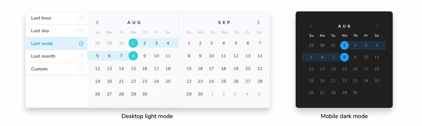
dark desktop spanishlight tablet koreanreduced-motion high-contrastright-to-left mobile
Let's delve deeper into modes and see how they connect with Storybook stories.
Modes are powered by Storybook globals & decorators
Consider this card component. It supports both light and dark variants, and its layout adjusts based on the viewport size. To switch between themes and viewport sizes, we click on the Storybook toolbar.
This functionality is made possible by two features: Globals and Decorators.
- Globals is a built-in mechanism that enables users to configure and track global settings. In the context of modes, globals are used to define different configurations that a mode can have. For example, theme: light & dark or locale: en, fr, es & kr .
- Decorators wrap stories to provide extra rendering functionality. They can read the global value and provide the necessary context to render a specific mode. For example, if your global state indicates "dark mode," a decorator can wrap your component with the appropriate theme provider and load the dark theme CSS.
Addons combine globals and decorators. Under the hood, many addons like @storybookjs/addon-themes and storybook-i18n use globals & decorators to provide the rendering context for stories.

How modes work
In a typical scenario, you would use viewports, styling, and background addons to control the theme, dimensions, and background color of a story. You define the values for these addons in .storybook/preview.ts like below:
// .storybook/preview.ts
import type { Preview } from '@storybook/react';
import { withThemeByClassName } from '@storybook/addon-themes';

/* import to your tailwind styles file */
import '../src/index.css';

const preview: Preview = {
  parameters: {
    viewport: {
      viewports: {
        small: { name: 'Small', styles: { width: '640px', height: '800px' } },
        large: { name: 'Large', styles: { width: '1024px', height: '1000px' } },
      },
    },
  backgrounds: {
    values: [
      { name: 'light', value: '#fff' },
      { name: 'dark', value: '#1E293B' },
    ],
  },
  },
  decorators: [
    withThemeByClassName({
      themes: {
        light: 'light',
        dark: 'dark',
      },
      defaultTheme: 'light',
    }),
  ],
};

export default preview;
Using modes, you could assign a mode to test any one of these global settings. Or group global settings you want to test together into one mode for convenience. Let’s see how that works.
Define modes in .storybook/modes
Define all your modes in the .storybook/modes.js|ts file. Each mode specifies values for the global settings associated with each addon.
// .storybook/modes.js|ts
export const allModes = {
  'dark mobile': {
    backgrounds: 'dark',
    theme: 'dark',
    viewport: 'small'
  },
  'dark desktop': {
    backgrounds: 'dark',
    theme: 'dark',
    viewport: 'large'
  },
  'light mobile': {
    backgrounds: 'light',
    theme: 'light',
    viewport: 'small'
  },
  'light desktop': {
    backgrounds: 'light',
    theme: 'light',
    viewport: 'large'
  }
};
Apply modes using the chromatic parameter
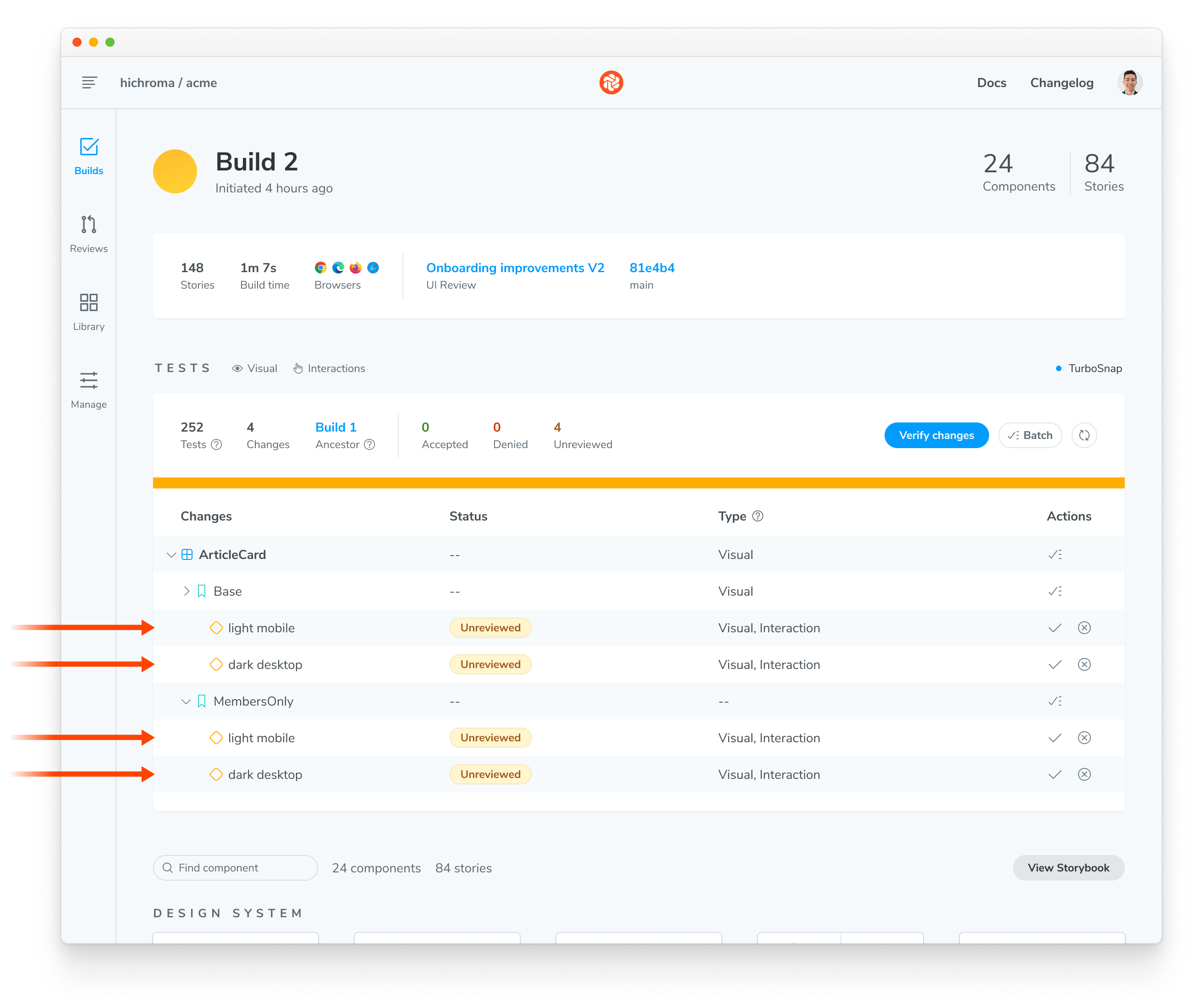
To apply the modes to a component, import them into a CSF (*.stories.js|ts) file and use the chromatic parameter.
// ArticleCard.stories.js
import { allModes } from '../.storybook/modes'

export default {
  parameters: {
    chromatic: {
	//🔶 Test each story for ArticleCard in two modes
      modes: {
        'light mobile': allModes['light mobile'],
        'dark desktop': allModes['dark desktop'],
      }
    }
  }
};

export const Base = {
  args: {
    //...
  },
};
export const Members only = {
  args: {
    //...
  },
};
Auto-generate a test for every mode
When you run a Chromatic build, it will create a test for each mode. If you have two stories with two modes, you’ll get four tests. Each test will be badged with the mode’s name and have separate baselines and approvals.
When reviewing a build, the mode-specific tests will be grouped together.
Migration from Chromatic viewports to modes
Chromatic currently allows you to run visual tests on a story across multiple viewport sizes using its viewport feature. The new modes API is a natural successor to that feature. With Modes, you’ll not only be able to test your stories in different viewports, but also any combination of global settings you define. What's more, you'll also be able to define specific viewport heights for tests.
For now, we will continue to support both APIs. This allows us to stabilize the modes API and gives you sufficient time to transition to the new API. In the meantime, behind the scenes Chromatic will convert viewports to modes when capturing a snapshot.
Follow us for project updates
Globals and Decorators work together to enable Storybook users to simulate various environments and conditions directly within their stories. With the integration of Modes in Chromatic, this flexibility and capability also extends to your visual testing workflow. This ensures that your components are robust and adaptable, capable of handling a multitude of scenarios.
Modes is currently in active development, and we plan to release a beta version in the upcoming weeks. We would love to get your assistance and feedback in testing it out to ensure that the API works for your workflow. Follow us on Twitter or subscribe to the RSS feed to get project updates.