GraphQL & React tutorial (part 4/6)
Using Storybook and Jest to build components in isolation and parallel

GraphQL & React tutorial is a series of posts following the development process of an “Inbox Zero” style todo list application, built in JavaScript with the most innovative and production ready tools as of early 2017. Parts: 1, 2, 3, 4, 5, 6.
In part 4 we are going to build up our frontend application to enable us to work on the core part of our UI: the components. I’ve previously written about the speed, cost, and quality advantages of Component-Driven Development (CDD). Building the Taskbox frontend is a great demonstration of how to use CDD in tandem with a component explorer to engineer components in isolation.
Component construction
We’ll cover three core facets of building the UI:
- Setting up the frontend application and importing some styles.
- Building and polishing a single component, the
Task, in isolation — without needing to build any other parts of our application. - Setting up automated tests for the
Taskto avoid regressions as we move forward with the app.
We’ve already defined the product, built out wireframes, and constructed a GraphQL schema in previous posts. It’s time to start writing some code!
Frontend foundation
Getting started with a React app is not as difficult as it used to be, but we still need to follow a few steps to get the build process set up.
To start with, we want to use Create React App (CRA) to setup our build system, and enable Jest and React Storybook in our created app. Let’s run the following commands:
# If you haven't already got some tools we need, install from npm
npm install --global create-react-app getstorybook yarn

# Create our application:
create-react-app tasklist
cd tasklist

# Add React Storybook:
getstorybook
We can quickly check the various environments of our application are working properly:
# Run the test runner (Jest) in a terminal:
yarn test

# Start the component explorer on port 9009:
yarn run storybook

# Run the frontend app proper on port 3000:
yarn start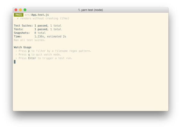
Depending on what part of the app you’re working on, you may want to run one or more of these simultaneously. Since the focus of part 4 is building a single UI component, we’ll stick with running React Storybook.
Reuse CSS
Taskbox reuses design elements from Meteor’s Todos application, so we won’t need to write CSS in this article. We’ll simply compile the LESS to a single CSS file and include it in our app. Copy and paste this compiled CSS into the src/index.css file per CRA’s convention. To modify the styling use the source LESS files.
Create React App doesn’t ship with support for any CSS pre-processors like LESS. If you wanted to use LESS in your project, you could either eject from CRA (i.e. build custom configuration from CRA’s base) and include a LESS webpack setup, setup a parallel build step for LESS (as documented here), or use a more flexible/powerful tool like next.js. Things are moving very rapidly, and this tutorial isn’t focused on CSS, so we won’t delve deeper into this here.
Add assets
We also need to add the font and icon directories to the public/ folder.
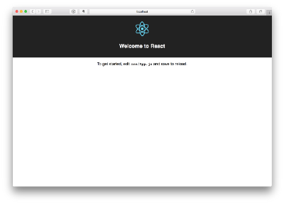
After adding styling and assets, the app will render a bit strangely. That’s OK. We aren’t working on the app right now. We’re starting off with building our first component!

Build the Task component
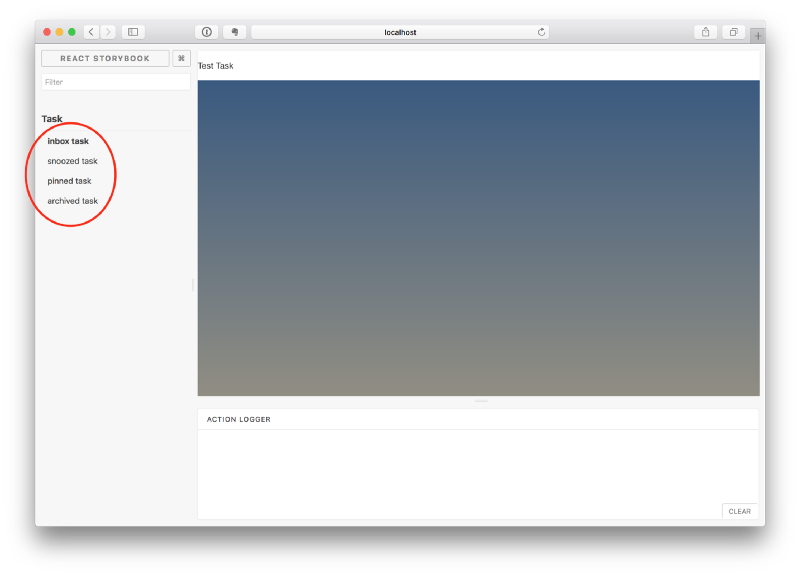
In part 3, we spent some time wireframing four different input states for our Task component, responsible for rendering the primary datatype in our app. Using a component explorer like React Storybook allows us to spec out each of those states in code as an input (or “story”) for a visual test case of our component.
This is great because it allows us to follow a process similar to Test-driven development (TDD) that we can call “Visual TDD”. We write our test states for the component first, then we use the component explorer to build the component incrementally in isolation. We’ll visually inspect the component’s appearance given each state as we go.
Get setup
First, let’s create the task component and its story file: src/components/Task.js and src/components/Task.story.js.
We’ll begin with a basic implementation of the Task, simply taking in the attributes we know we’ll need (we enumerated the required data in the previous post) and the two actions you can take on a task (to move it between lists):
Above we we render straightforward markup for task based on the existing HTML structure of the Todos app.
Below we build out task’s four test states in the story file:
React Storybook is initiated by calling the storiesOf() function to register the component. .addDecorator() allows us to add some “context” to the rendering of each task (we’ll need this because the existing styles are targeted within the .list-items selector). We also sometimes use addDecorator() to wrap test elements in “providers” — i.e. library components that set React context.
After that, we call add() once for each of our test states, passing a function that returns a rendered element (i.e. a component class with a set of props). We’ll reuse a buildStory helper; although it would be nicer to auto-generate a test task from the schema of the task. (I’ll leave this as an exercise for the reader that would make an awesome open-source project!)
One interesting thing we do is create “actions” with the action() function. What this does is create a stubbed callback that appears in the React Storybook UI when we call it. So when we build a snooze button, we’ll be able to determine in the test UI if a button click is successful.
We also have to make one small change to the React Storybook setup so it notices our .story.js files (by default it looks in a stories directory, but we’ll use that naming scheme to mirror the .test.js naming scheme favoured by CRA for automated tests), and uses our CSS file:
Once we’ve done this, restarting the storybook server should yield test cases for the four Task states:
Build out the states
Now we have the component explorer setup, styles imported, and test cases built out, we can quickly start the work of implementing the HTML of the component to match the wireframe (and in the ideal world, visual spec).
The component is still basic at the moment, so I’ll write the code that achieves the wireframes without going into too much detail:
The additional markup from above combined with the CSS we imported earlier yields the following UI:
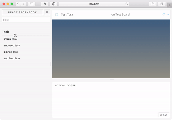
We ensure that clicking on the buttons logs actions in the “Action Logger” with theaction() helper.
Specify data requirements
It’s best practice to use propTypes in React to specify the shape of data that a component expects. Not only is it self documenting, it also helps catch problems early. As we know we’ll be using GraphQL data from Apollo, we can use a Relay-style fragment co-location technique to help match the Task component’s propType with the eventual query we’ll use to fetch the data.
We start by adding two useful utility GraphQL libraries using yarn:
yarn add graphql-tag graphql-anywhereThen we describe the expected task argument to Task as a GraphQL Fragment:
Use the propType helper exported by graphql-anywhere to ensure that any task passed into the component “fits” that fragment:
Now a warning in development will appear if the Task component is misused.
An alternative way to achieve the same purpose is to use a JavaScript type system (either Flow or TypeScript) to create a type for the component properties, and then later use Apollo codegen to build types for our GraphQL queries. We could then statically typecheck that we are fetching and passing the correct data for our components in a way that is less coupled to our GraphQL schema. This seems like an interesting avenue for further exploration and one I’ll cover in a later post.
Component built!
We’ve now successfully built out a component without needing a server or running the entire frontend application. The next step is to build out the remaining Taskbox components one by one in a similar fashion — in fact, given that we’re able to build each component in isolation, maybe our teammates have already been doing so while we built this one!
Aside from enabling parallel production, building components in in isolation is easier and faster. We can expect to produce a higher-quality UI with less bugs and more polish because it’s possible to dig in and test each possible state.
Automated Testing
React Storybook gave us a great way to visually test our application during construction. The ‘stories’ will help ensure we don’t break our Task visually as we continue to develop the app. However, it is a completely manual process at this stage, and someone has to go to the effort of clicking through each test state and ensuring it renders well and without errors or warnings. Can’t we do that automatically?
Snapshot testing
Snapshot testing refers to the practice of recording the “known good” output of a component for a given input and then flagging the component whenever the output changes in future. This complements React Storybook, because it’s a quick way to view the new version of a component and check out the changes.
With the Storyshots addon a snapshot test is created for each of the stories. Use it by adding a development dependency on the package:
yarn add --dev storyshotsThen create an src/index.test.js file with the following in it:
There is one minor wrinkle: we just need to add the following section to our package.json:
"babel": {
  "presets": ["react-app"]
}
Once the above is done, we can run yarn test and see the following output:
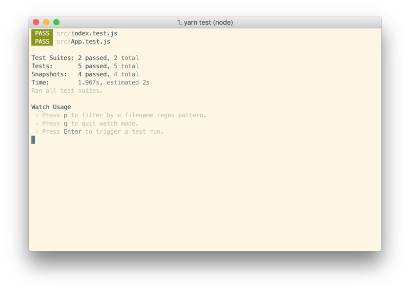
We now have a snapshot test for each of our four Task stories, and if we change the implementation of Task, we’ll be prompted to verify the changes.

Jest tests
Taskbox doesn’t have a lot of complexity, and for the Task, there’s not much to test beyond that it renders OK. For other components we may want to verify that certain inputs produce certain outputs in a way amenable to automatic testing. Jest coupled with a test renderer such as Enyzme is a great way to approach this; we might simply create a test file called Task.test.js and build out our tests that make assertions about rendered output.
An even more interesting avenue is to make those assertions within our stories. This means every time a story is viewed (or snapshot test run) the assertions are checked, and we could reuse the states defined by the stories for automatic checks. The Storybook spec addon seems like a great step in this direction.
Conclusion
This post outlines a method for constructing React components that leans heavily on the component explorer React Storybook (the same process can be applied to different view layers as well). While we focussed only on building the Task component in this post, we’d continue to follow a similar methodology for remaining low-level components.
In Part 5, linked below, we walk through building the screens of application by combining components together and feeding them GraphQL data.