How to build a Storybook addon
Enhance and automate parts of your UI development workflow.

Storybook is a tool for developing UI components outside your app in an isolated environment. Storybook addons allow you to enhance and automate parts of your workflow. While the Storybook community offers over 200 of them, you can also build one tailored to your specific needs.
Building an addon is straightforward. In this post, I’m going to help you build your first Storybook addon. We’ll walk through the APIs and architecture.
What are we going to build?
It's tough to tell if your CSS layout matches the design. Eyeballing alignment is tricky when DOM elements are far apart or odd shapes.
Addon Outline adds a toolbar button that outlines all UI elements using CSS. That makes it easy to verify positioning and placement in a glance. Check out the example below.
The anatomy of an addon
Addons allow you to extend what’s possible with Storybook. Everything from the interface to the APIs. They ⚡supercharge⚡ the UI engineering workflow.
There are two broad category of addons:
- UI-based: customize the interface, add shortcuts for repetitive tasks or format and display additional information. For instance: documentation, accessibility testing, interactive controls, and design previews.
- Presets: a collection of Storybook configurations that get applied automatically. These are often used to quickly pair Storybook with a specific technology. For example, the preset-create-react-app, preset-nuxt and preset-scss.
UI-based addons
Addons can create three types of interface elements:
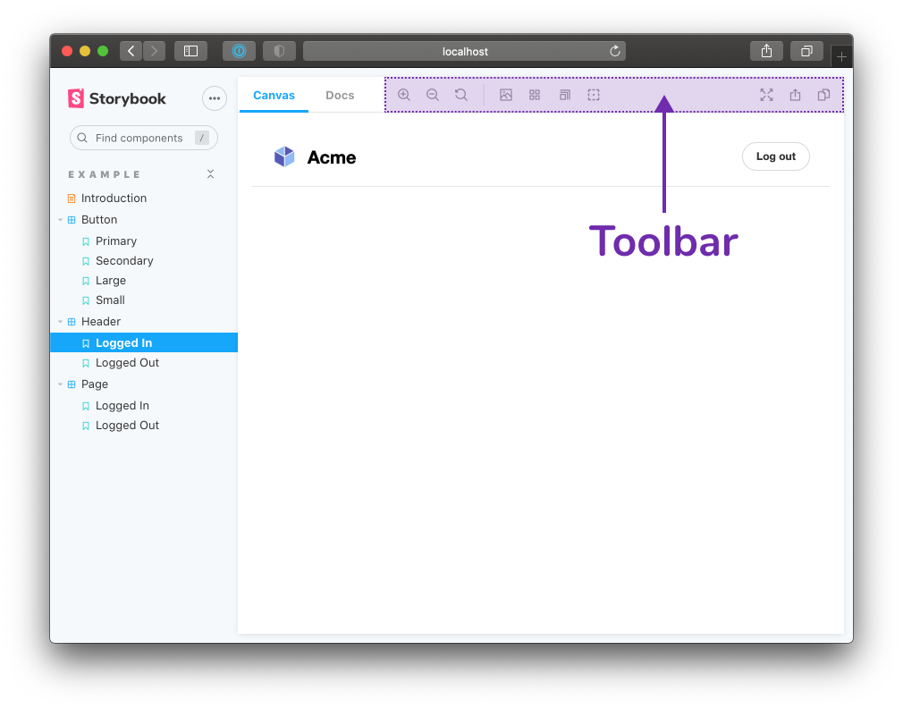
1. You can add a tool to the Toolbar, for example the Grid and Background tools
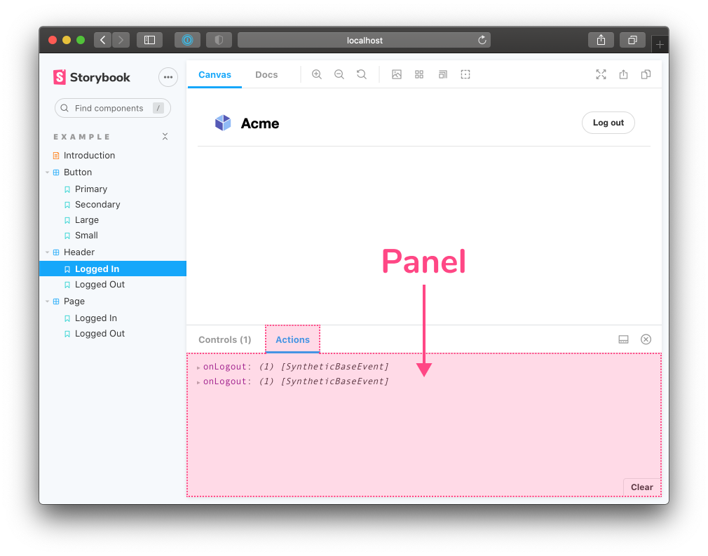
2. Create an addon Panel similar to the Actions addon which displays a log of actions
3. Create a new Tab much like SB Docs which displays the component documentation.
It’s clear that addons can do a lot. So how do you build an addon?
For the Outline addon, a user should be able to click a button in the toolbar to draw outlines around each element in the story. And click that button again to remove all the outlines. Our addon code has four parts:
- UI that creates the “tool” button in the toolbar. This is what the user clicks.
- Registration of the addon with Storybook.
- State management to track the toggle state of the tool. This controls whether the outlines are visible or not.
- Decorator that injects CSS in the preview iframe to draw the outlines.
Getting started
We need to be able to test out this plugin as we are developing it. I used npx sb init to bootstrap a bare-bones React Storybook setup. All the code for the plugin will live in the top level src directory.
For reference, you check out the full source code here.
Building the UI & registering the addon
Storybook has its own component library, @storybook/components, built with React and Emotion. We use it to build, well, Storybook (demo). This is quite handy because you can use these components to build your addon too. In this case, we’ll use the Icons and IconButton components to create the outline selector tool. For the most part, this is a vanilla React component.
In this case, we’ll use the Icons and IconButton components to create the outline selector tool. For the most part, this is a vanilla React component.
// OutlineSelector.js

import React, { useState, memo } from 'react';
import { Icons, IconButton } from '@storybook/components';

export const OutlineSelector = memo(() => {
  const [outline, setOutline] = useState(false);
  const toggleOutline = () => setOutline(!outline);

  return (
    <IconButton
      key="outline"
      title="Apply outlines to the preview"
      onClick={toggleOutline}
    >
      <Icons icon="outline" />
    </IconButton>
  );
});
Register the addon with Storybook using a unique ADDON_ID. I recommend something like storybook/addon-name. Notice the match property. It allows you to control which view mode the addon can be used in. In this case, the addon will be available in story and docs mode.
// register.js

import React from 'react';
import { addons, types } from '@storybook/addons';

import { ADDON_ID } from './constants';
import { OutlineSelector } from './OutlineSelector';

addons.register(ADDON_ID, () => {
  addons.add(ADDON_ID, {
    title: 'Outline',
    type: types.TOOL,
    match: ({ viewMode }) => !!(viewMode && viewMode.match(/^(story|docs)$/)),
    render: () => <OutlineSelector />,
  });
});
To start using the plugin add a reference to register.js in your .storybook/main.js file and start your Storybook.
// .storybook/main.js

module.exports = {
 stories: [
   '../stories/**/*.stories.mdx',
   '../stories/**/*.stories.@(js|jsx|ts|tsx)',
 ],
 addons: ['@storybook/addon-essentials', '../src/register.js'],
};
At this point you should see the outline selector tool in the toolbar 🎉
Track state
I started off by using a useState hook to control the toggle state. Usually, this would be enough. However, in this case things are slightly more complicated. Let’s take a moment to talk about how Storybook is architected.
Basics of Storybook’s architecture
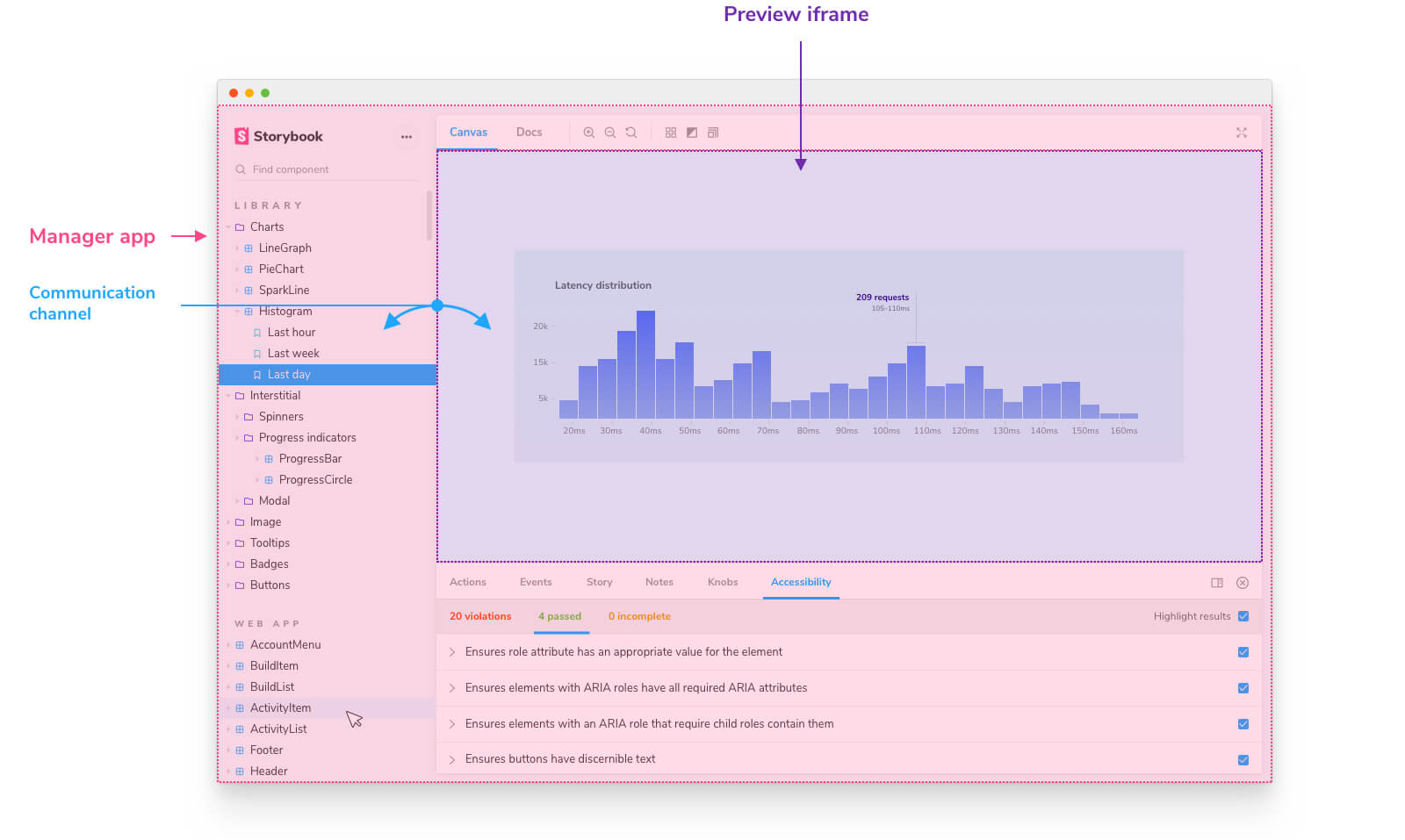
On the surface, Storybook presents a unified user interface. However, under the hood it’s divided the into two segments that talk to each other across a communication channel:
- A Manager: the UI where Storybook’s search, navigation, toolbars, and addons are rendered.
- Preview: an iframe where your stories are rendered.
We need to track the toggle state and we also need to share that state across both the Manager and Preview. Therefore, instead of useState we are going to use useGlobals.
Track global state
Globals represent the “global” (as in not story-specific) context in Storybook. They are a handy way to share information between different stories, addons and decorators. The useGlobals hook that allows you to access this global context within the tool that you’re building. You can find this and other addon related APIs in the @storybook/addons package.
Let’s update the OutlineSelector to use globals. Again, using a unique identifier PARAM_KEY to track the outline toggle state. At this point you should not only be able to see the outline selector tool but also toggle it on and off 👉🏽🔘
// OutlineSelector.js

import React, { memo, useCallback } from 'react';
import { useGlobals } from '@storybook/api';
import { Icons, IconButton } from '@storybook/components';
import { PARAM_KEY } from './constants';

export const OutlineSelector = memo(() => {
  const [globals, updateGlobals] = useGlobals();

  const isActive = globals[PARAM_KEY] || false;

  const toggleOutline = useCallback(
    () =>
      updateGlobals({
        [PARAM_KEY]: !isActive,
      }),
    [isActive]
  );

  return (
    <IconButton
      key="outline"
      active={isActive}
      title="Apply outlines to the preview"
      onClick={toggleOutline}
    >
      <Icons icon="outline" />
    </IconButton>
  );
});
Interacting with the stories — decorator
Almost there. So far, we created a tool, added it to the toolbar and it even tracks state. We now need to respond to this state and show/hide the outlines.
Decorators wrap stories and add-in extra rendering functionality. Pesticide uses this bit of CSS to draw outlines around all HTML elements. We are going to create a decorator that responds to the outline global and handles CSS injection.
In the previous step we defined the outline global, let's wire it up! We can consume our new global in a decorator using the context.globals[PARAM_KEY] value.
// withOutline.js

import { PARAM_KEY } from './constants';

export const withOutline = (StoryFn, context) => {
 const { globals } = context;
 const isActive = globals[PARAM_KEY] === true;

 return StoryFn();
};
Adding and clearing styles is a side-effect, therefore, we need to wrap that operation in useEffect. Which in turn is triggered by the outline global.
// withOutline.js

import { useMemo, useEffect } from '@storybook/addons';
import { clearStyles, addOutlineStyles } from './helpers';
import { PARAM_KEY } from './constants';
import outlineCSS from './outlineCSS';

export const withOutline = (StoryFn, context) => {
  const { globals } = context;
  const isActive = globals[PARAM_KEY] === true;
  const isInDocs = context.viewMode === 'docs';

  const outlineStyles = useMemo(() => {
    const selector = isInDocs
      ? `#anchor--${context.id} .docs-story`
      : '.sb-show-main';

    return outlineCSS(selector);
  }, [context.id]);

  useEffect(() => {
    const selectorId = isInDocs
      ? `addon-outline-docs-${context.id}`
      : `addon-outline`;

    if (!isActive) {
      clearStyles(selectorId);
      return;
    }

    addOutlineStyles(selectorId, outlineStyles);

    return () => {
      clearStyles(selectorId);
    };
  }, [isActive, outlineStyles, context.id]);

  return StoryFn();
};
Ok, that seems like a big jump. Let’s walk through all the changes.
The addon can be active in both docs and story view modes. The actual DOM node for the preview is different in these two modes. In fact, the docs mode renders multiple story previews on one page. Therefore, we need to pick the appropriate selector for the DOM node where the styles will be injected. Also, the CSS needs to be scoped to that particular selector.
Next, as we inject the styles into the DOM we need to keep track of them so that we can clear them when the user toggles it off or switches the view mode.
As for the actual CSS logic I have a few helpers that use DOM APIs to inject and remove stylesheets.
Note, the useMemo and useEffect here come from @storybook/addons and not React. This is because the decorator code is running in the preview part of Storybook. This is where the user's code is loaded which might not contain React. Therefore, to be framework agnostic, Storybook implements a simple React-like hook library which we can use!
Preset to enable outline for all stories
Now that the decorator is out of the way, let's use a preset to wrap every story with it.
Presets allow you to combine a bunch of different Storybook configurations and apply them in one go. We have two bits of configuration which our preset is responsible for:
- Wrap each story in a decorator
- Register the addon
// preset/index.js

export function config(entry = []) {
 return [...entry, require.resolve('./addDecorator')];
}

export function managerEntries(entry = []) {
 return [...entry, require.resolve('../register')];
}
// preset/addDecorator.js
import { withOutline } from '../withOutline';
export const decorators = [withOutline];And lastly you need to update the .storybook/main.js file to use the preset instead of using the register directly.
// .storybook/main.js

module.exports = {
 stories: [
   '../stories/**/*.stories.mdx',
   '../stories/**/*.stories.@(js|jsx|ts|tsx)',
 ],
 addons: ['@storybook/addon-essentials', '../src/preset.js'],
};
Restart your Storybook and you now have a fully functional addon!
Conclusion
Success! We used Storybook’s addon API to create the new Outline addon (GitHub). The API did most of the integration work for us. All we had to provide was the idea and customization.
You can try out this addon today npm i -D storybook-addon-outline. It requires Storybook 6.1 or later. Install the latest with npx sb upgrade --prerelease.
Storybook’s most popular features are implemented as addons under the hood. For example Docs, Controls, Actions and Viewports. This article only scratches the surface of what’s possible. I’m excited to see what you come up with.
In the next post I’ll show you how to package and publish your addon to the official catalog.
If you’re creating an addon, give me a shout on Twitter. Sign up for our newsletter to be the first to hear about it.
Outline addon was inspired by the Pesticide Chrome extension.