Viewports for responsive UIs with breakpoints
UI components respond and adapt to different device widths. Chromatic streamlines visual testing, enabling you to capture each test at multiple viewport sizes. Viewports is compatible with Storybook, Playwright, and Cypress integrations.
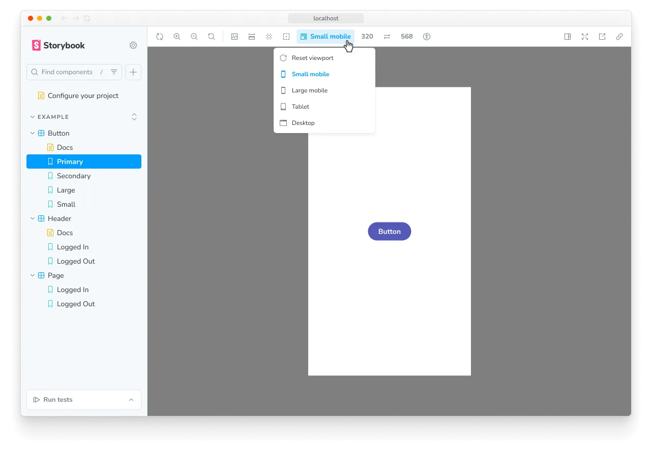
Storybook
For Storybook, viewports are configured using the Modes API, which allows you to set global configurations that affect how a component renders (e.g., viewport size, theme & locale).
Chromatic also integrates with Storybook’s viewport feature. You can specify viewports by the names configured in Storybook’s .storybook/preview.js|ts file. And if a story has a defaultViewport set, Chromatic will automatically use that to capture the snapshot.
For detailed usage instructions, refer to the configure viewports for stories page.
Playwright
Chromatic will capture the DOM and take snapshots at the viewport size in which a test is configured to run.
Viewports in Playwright can be configured globally in your main Playwright configuration file as follows:
import { defineConfig } from '@playwright/test';

export default defineConfig({
  projects: [
    {
      name: 'chromium',
      use: {
        ...devices['Desktop Chrome'],
        viewport: { width: 1280, height: 720 },
      },
    },
    {
      name: 'Mobile',
      use: {
        ...devices['Desktop Chrome'],
        viewport: { width: 500, height: 600 },
      },
    },
  ],
});
Or at the test level:
test.describe('Page display on medium size screen', () => {
  // 👇 Overrides the option in the test.
  test.use({
    viewport: { width: 1600, height: 1200 },
  });

  test('Does not display sidebar', async ({ page }) => {
    await page.goto('/');
  });
});
Cypress
Chromatic will capture the DOM and take snapshots at the viewport size in which a test is configured to run.
Viewports in Cypress can be configured globally in your main Cypress configuration file as follows:
import { defineConfig } from 'cypress';

export default defineConfig({
  viewportWidth: 1000,
  viewportHeight: 660,
});
Or using configuration at the test level:
describe(
  'Page display on medium size screen',
  {
    // 👇 Overrides the option in the test.
    viewportHeight: 1000,
    viewportWidth: 400,
  },
  () => {
    it('Does not display sidebar', () => {
      cy.visit('/');
    });
  }
);
ℹ️ Currently, setting the viewport using cy.viewport() is not supported.