Storybook vs Styleguidist
A comparison of the top UI component explorers

Update Oct 2019: Storybook Docs now allows you to write Markdown/MDX to generate styleguides directly from Storybook. Take a peek if you’re on the fence about which tool to choose.
If you’re looking for UI component tools chances are you’ve stumbled across Storybook and Styleguidist. On the surface, both have similar features and are used by teams around the world. It can be tough to pick the right one for your project.
Previously on this blog I introduced readers to the concept of UI component explorers, a class of tools for developing UI components that include Storybook and Styleguidist. Since then, the space rapidly evolved. Component explorers are now used by thousands of companies around the world and growing.
I decided to re-examine two standout tools for UI components. This article looks at the unique strengths and design intent of Storybook and Styleguidist.

Why do you need UI component tools?
First, let’s get a question out of the way. You already have browser developer tools, a code editor, and lots of coffee so why do you need more tools?
Modern view layers like React, Vue, and Angular are centered on the component construct. A method of building complex UIs that has you first break them down into simple modules (components).
The transition from page-first to component-first requires new tools for concentrating on component fabrication. The existing tooling evolved for creating pages and screens not components. Storybook and Styleguidist are designed for developing components.
Workshop vs Storefront
Brad Frost wrote a seminal article on the difference between a workshop and storefront in UI development. Developers create UI patterns in a workshop and document them in the storefront. Since the use cases are quite different he proposes that the tools should also be different.
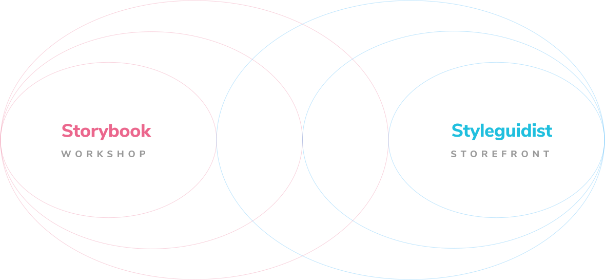
Indeed, it’s a useful analogy for comparing Storybook and Styleguidist as well. Storybook aligns with the workshop while Styleguidist the storefront.
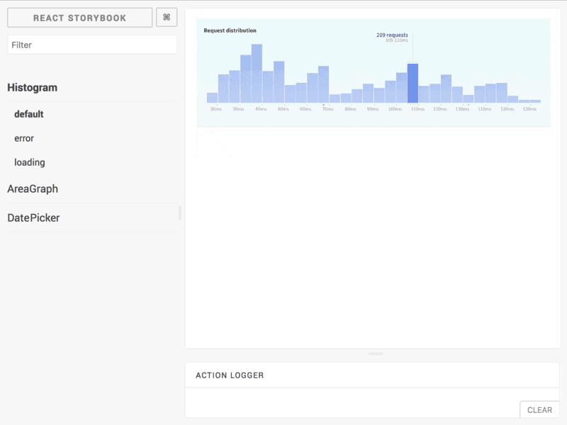
Storybook the workshop
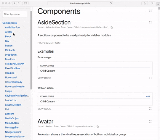
Storybook is a development environment for UI components. It helps you build UI components in isolation and offers handy features to mock state, data, and adjust props. When you’ve successfully rendered a component variation you save it as a “story” to revisit during testing.
Storybook helps you create
The primary purpose of a development environment is to help you build with new technologies. The idea is that new technology requires custom tools to take full advantage of what it has to offer. Storybook was one of the first tools for UI components, as such it also has feature maturity and momentum relative to Styleguidist.
Why use Storybook
Storybook is by far the most widely adopted UI component tool. Developers attest that it provides enormous value for the ABCs of creating UI components. Whether you’re a solo developer or a development team, you get more productive at your job immediately. What’s more, the thriving addon ecosystem helps you extend Storybook’s functionality.
In practice, teams use Storybook to start building UI components in isolation and reason about the increasingly complex frontend architecture.
Styleguidist the storefront
Styleguides are artifacts that serve as documentation for UI; which includes colors, typography, as well as components. In the past, they required a lot of discipline(read: overtime) to maintain so they often ended up in disrepair.
Styleguidist simplifies creating and maintaining a UI documentation site which includes UI components. I liken it to a static-site generator on steroids. It allows you to create pages in Markdown and import UI components. To fully understand the why you might use Styleguidist, let’s look the organizational value of the styleguide artifact.
Styleguides help you reuse UI patterns
The primary purpose of styleguides is to increase the adoption of UI patterns in an organization. In other words, they help scale UI. The idea is that designers and developers will reuse established patterns (which saves money and increases consistency) if they’re well-documented and in a central location.
Why use Styleguidist
Teams value centralized documentation because it serves as a source of UI truth for an entire organization. When a styleguide is followed you promote consistency and encourage reuse. Styleguides can make teams much more productive.
However, even though Styleguidist simplifies creating documentation there is still a maintenance cost that can’t be overlooked. Many teams lack the resources to continually maintain detailed docs which often results in styleguide mortality. When documentation lags, folks are reluctant to adopt UI patterns, thereby defeating the purpose of a styleguide.
Storybook and Styleguidist: Which one is right for you?
Storybook and Styleguidist are tools for UI components and libraries. In Storybook you build components and write stories to keep track of component permutations. In Styleguidist you document components via Markdown.
Storybook and Styleguidist are converging in the space between workshop and storefront. Although they overlap on many features each has a different perspective on UI component development. Developers love both for good reason. Here are some guidelines to help you choose:
Storybook helps you build and test components. If you find yourself needing a convenient way to keep track of UI component props, state, and context Storybook is perfect for you. In addition, you get the momentum of a massive developer community and addon ecosystem. Learn more:
- 📚 Learn Storybook: A free tutorial that teaches you to Storybook essentials by building a UI from scratch
- 📕 Storybook site and docs: Explore the API, addons, and configuration
- 👷♀️The Delightful Storybook Workflow: See how professional teams get the most out of Storybook
- 📦 Github repo
Styleguidist helps you document components. If you find yourself writing detailed API and usage documentation in styleguide format Styleguidist makes your life easier. Read on:
- 🎨 Styleguidist site and docs: Overview and API docs
- 📦 Github repo
How to get the best of both worlds
What if you could build your components in a workshop like Storybook and document them in a styleguide-generator like Styleguidist? If your dev team exposed component variations from Storybook that could then be curated by a product/design team in a styleguide you wouldn’t have to choose between tools!
In my ideal world the workshop and storefront are separate but symbiotic tools. Each is tailored to solve a specific use case well. Unfortunately, this world doesn’t exist… yet.
Learn more
Want to learn more about UI component development? These articles will give you a head start:
- UI Component Explorers: Get an overview of UI component tools (including Storybook and Styleguidist) for each view layer.
- Prefabricated components: Why building UI components in isolation makes you more productive and your UI more durable.
- UI Component Playbook: A 5-step guide to designing and engineering frontends with components