Meet Storybook 5.0's new design
Introducing the fresh look and feel of Storybook 5.0

Storybook now supports every major view layer, countless cases, and armies of frontend developers. Despite these giant leaps in functionality, the core user experience hasn’t changed since 2016.
If you build UIs for a living like me, you spend hours in Storybook every day. You tend to notice the inconsistencies that slow you down. In Storybook 5.0 we introduce a polished new developer experience that helps you ship components faster than ever.
Storybook gets out of your way
Make no mistake, Storybook 5.0 doesn’t redesign the wheel. The project’s popularity is a testament to the current workflow. The maintainers wouldn’t do anything to mess that up.
Rather, 5.0 resolves years of accumulated community feedback and introduces new customization options. As an end user, you’ll notice a polished new look and feel atop a familiar workflow.
Read Michael Shilman’s official 5.0 release post here
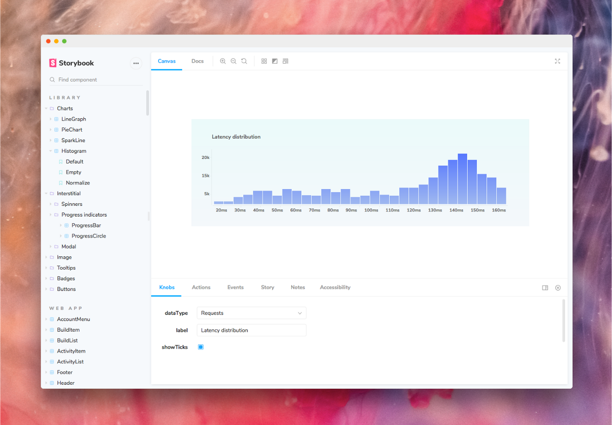
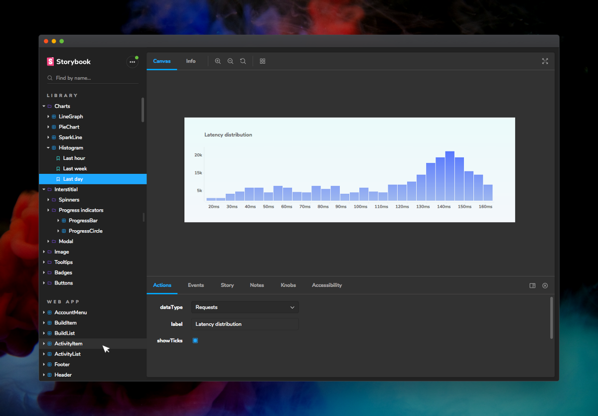
Canvas toolbar
The canvas visualizes your component. The new canvas toolbar includes tools to help you stress test the design implementation.
- 🔍 Zoom: Inspect the tiniest details by enlarging your UI
- 📐 Grid: Verify alignment with handy gridlines
- 🎨 Background: Examine contrast ratio by adjusting the background (via addon)
- 🖼 Viewport: Test responsiveness by switching between viewport widths (via addon)
- 🖥 Full screen: Focus on your component by hiding the Storybook UI
That’s not all. Just like the addons panel the toolbar is extendable. This means intrepid addon creators can create powerful tools that affect what’s rendered in the canvas.
Sidebar overhaul
This release also features dramatic improvements to the predictability and layout of the sidebar.
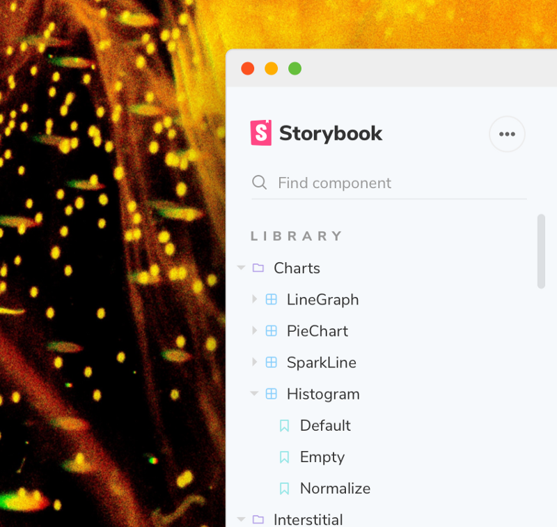
- 🗂 Icons: Differentiate between directories, components, and stories in a glance.
- 📏 Layout: Spacing adjustments make it easier to skim the stories list (the information density remains the same!)
- ⚙️ Menu: Access common functionality like UI toggles, navigation, and update notifications.
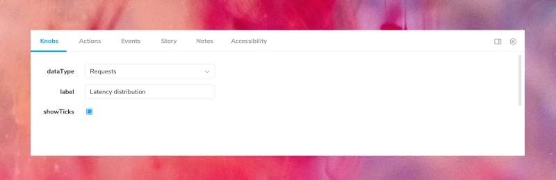
Addons panel
Addons allow developers to extend the core Storybook workflow. The redesigned addons panel provides more real estate for addons and includes handy buttons to toggle visibility and change orientation.
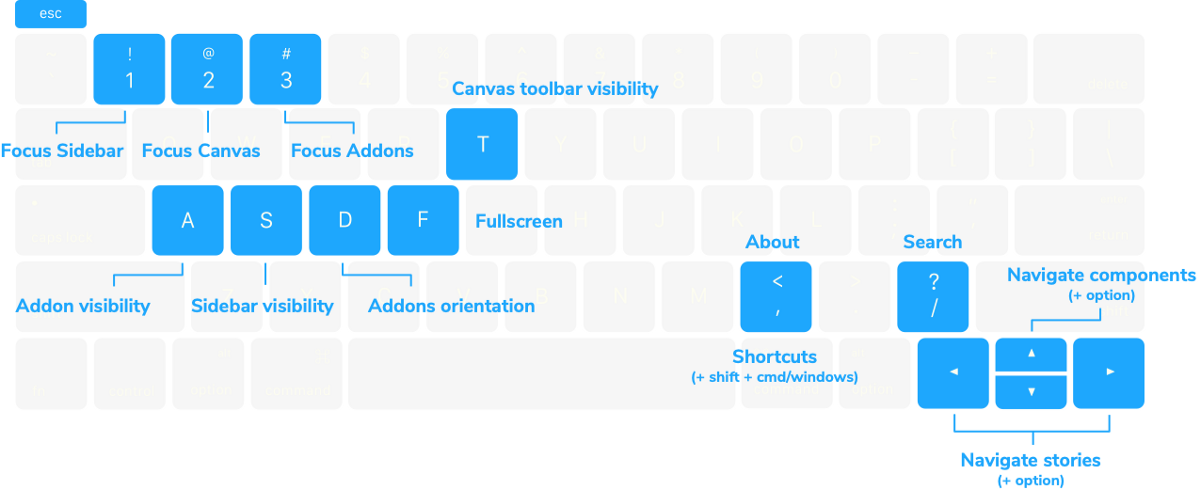
Keyboard shortcuts
Shortcuts help you do more in fewer keystrokes. This release ships with more intuitive default shortcuts — no more blindly mashing keys because you forgot which combination of cmd + ctrl + option to press.
What’s more, the shortcuts are editable. When you change a shortcut it’ll be saved in your browser cache. Shoutout to Jessica and Tom for their amazing contributions.
Theming & dark mode
Storybook ships with a new user interface, but there’s no accounting for personal taste or branding requirements. The 5.0 theming API makes it easier than ever to tweak the aesthetics.
Re-architected for speed
Not only does Storybook look new it also feels new. The re-architected 5.0 frontend from Norbert delivers a performance boost of up to 300% compared to 4.0. Furthermore, it’s easier than ever for first-time contributors to read and understand the code.
Upgrade to Storybook 5.0
Storybook 5.0 is the most significant update yet. Lucky for you, it’s also one of the easiest to migrate to. Read the 5.0 upgrade guide. If you’re on 3.x, checkout the 4.0 upgrade guide.
Get involved
Storybook is maintained by a thriving open source community and guided by a steering committee of top maintainers.
Contributions from both new developers and experienced veterans are welcome. If you’re interested in design and component libraries here are upcoming projects I’m personally stoked about:
- Styleguide generation: Auto generate docs from your existing stories
- Addon kit: A toolkit to help developers scaffold their own addons
- Design system: We’re codifying Storybook’s official UI component library
You can find me in Storybook’s Discord chat #design.